Design comparison
Solution retrospective
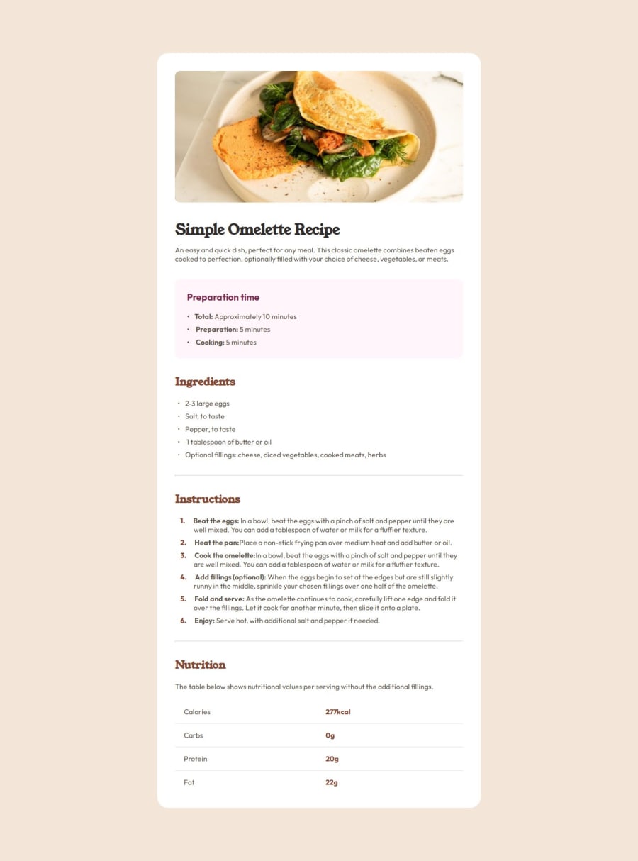
Not much that I am proud of, it was a very hard challenge and I struggled much more than my last one. This time around I didn't use a Figma file, so I had to eyeball font sizes, paddings and margins, but I don't mind the inconsistencies in this case.
I wish that I had given a better solution to styling ol, ul and li.
I struggled to style ol, ul and li.
I think, visually speaking, that I did a good enough job with the numbered list, but the CSS solution was pretty messy and I think that I got there just by trial-and-error.
The bulleted lists look okay, but they don't behave "properly" when the li content is longer than one line. I struggled to make the indentation right to the bullet to be equal on both the 1st and 2nd lines of text.
I managed to fix that in the numbered list, but very sloppily.
What specific areas of your project would you like help with?Like I mentioned above, a better solution to ol, ul and li styling.
Community feedback
Please log in to post a comment
Log in with GitHubJoin our Discord community
Join thousands of Frontend Mentor community members taking the challenges, sharing resources, helping each other, and chatting about all things front-end!
Join our Discord
