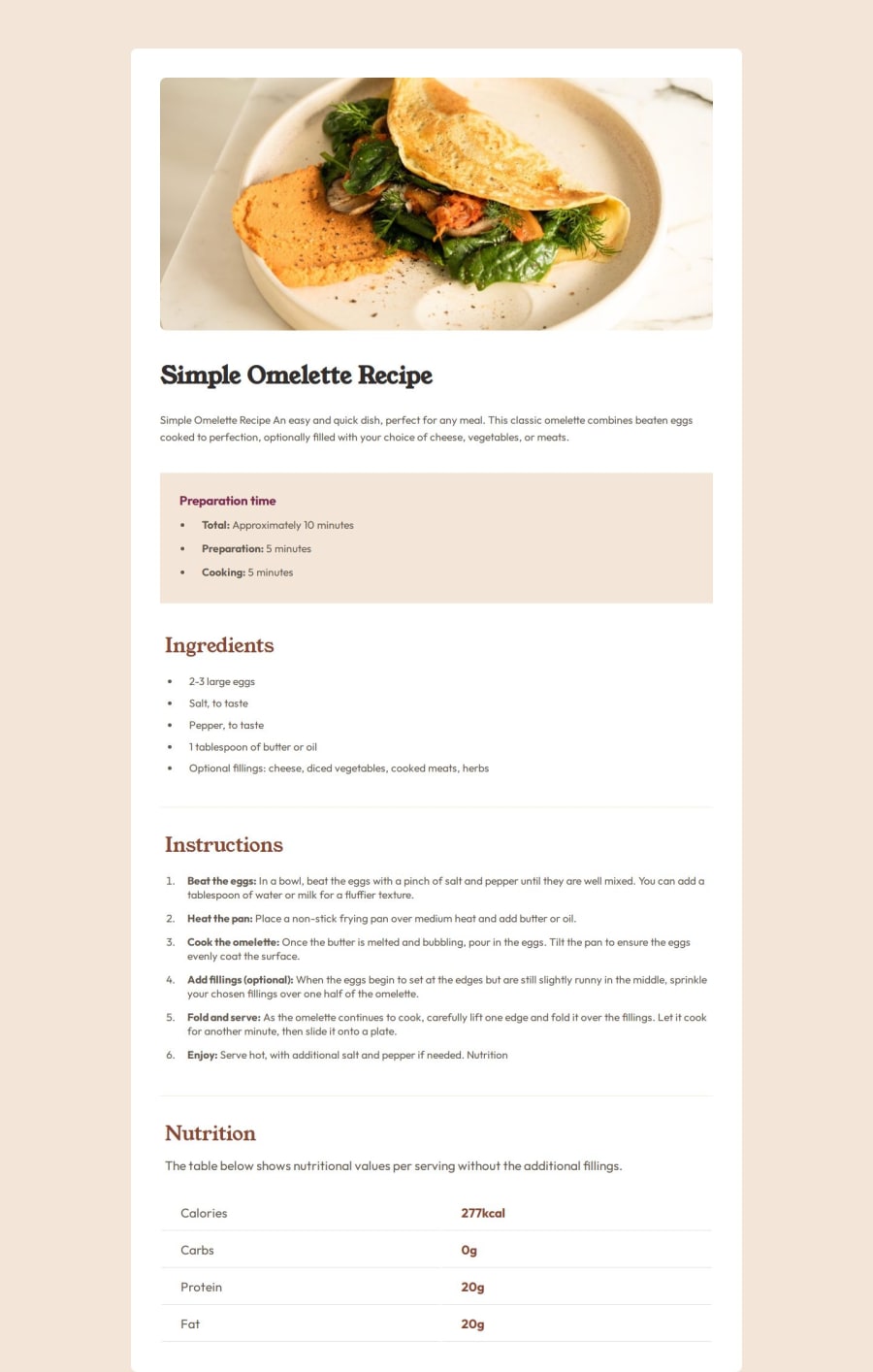


Design comparison

Solution retrospective
I think i worked better with divs and flexbox this time. I try to make it responsive without media queries.
What specific areas of your project would you like help with?Any feedback is more than welcome, i'm always trying to improve. Thank you!
Community feedback
- P@AydanKaraPosted 24 days ago
Hey @jarthurofv,
I just reviewed your HTML code, and I have to say it looks really clean and well-structured! Your HTML structure is well-organized, readable, and follows good coding practices. I can see you put a lot of effort into organizing the layout!
I will try below to give detailed feedback focusing on semantic HTML, accessibility, and potential improvements.
Strengths:
✅ The code uses semantic elements such as
<h1>,<h2>,<h3>,<p>,<ul>,<ol>, and<table>, which improve both SEO and accessibility.✅ The
<strong>tags are used to highlight important parts of the recipe, which improves readability.Areas for improvement:
🔹 Use
<header>and<main>elements- Right now, all content is inside a
<div class="container">. Instead, wrap the content in a<main>element to better indicate the page’s main content.
Example Improvement:
<body>
  <header>
    <h1>Simple Omelette Recipe</h1>
  </header>
  <main>
    <section>
      ...
    </section>
  </main>
</body>
🔹 There's an instance where a
<h1>is followed by a<h3>without an<h2>in between:<h1 class="omelette">Simple Omelette Recipe</h1> ... <h3 class="preparation">Preparation time</h3>-
Headings should follow a logical order (h1 → h2 → h3, etc.).
-
Skipping heading levels (e.g., jumping from
<h1>to<h3>) can affect accessibility and document structure. -
Screen readers and search engines rely on headings to understand the content hierarchy. A missing
<h2>might make it harder to navigate.
Here you can read more about of using heading elements.
🔹 The
<div class="separator"></div>element is non-semantic – If this is purely for styling purposes, consider using CSS instead (e.g., border-bottom or margin for spacing).🔹 Improve table structure The
<table>currently has an empty<th></th>element, which is unnecessary. Also, adding a<caption>would make the table more meaningful for assistive technologies.Overall, your code is really well-organized and visually appealing. Just a few small tweaks can make it even better!
If you want I can also give you Feedback on the CSS code.
Please if you have any questions don't hesitate to ask.
Marked as helpful0@jarthurofvPosted 24 days ago@AydanKara Hi Aydan,
Thank you for taking the time to share your thoughtful feedback—I truly appreciate it! I'll make sure to implement your suggestions. Additionally, I’d love to hear any CSS-related feedback you might have. Thank you again!0P@AydanKaraPosted 24 days ago@jarthurofv Okay let's move on to CSS
Your CSS is well-structured, uses a clean and readable format, and applies good styling principles.
Strengths of Your CSS
✅ Good Reset with
*Selector- Using
margin: 0; padding: 0; box-sizing: border-box;ensures consistent spacing across all elements.
✅ Effective Layout
- The
.containerusesdisplay: flex; flex-direction: column;effectively for centering content.
✅ Good Use of
border-radiusandobject-fiton Images- This ensures images look sharp and well-placed.
Improvement & Suggested Fixes
1. Improve
bodyheight handling-
Using
height: 100vh; can cause layout issues on mobile devices when the browser’s address bar hides/shows. -
If content overflows,
100vhmight prevent scrolling.
✅ Use
min-height: 100vh; instead to allow scrolling when needed:body { width: 100%; min-height: 100vh; }2. Center
.containerBetter on Smaller Screens-
On smaller screens,
70%width might be too narrow. -
Instead, use
max-widthwith relative units.
.container {
  width: 100%;
  max-width: 50rem;
}
✅ This makes the layout more responsive without being too wide on desktops or too narrow on mobile. And we comply with the given design.
- You can change the values according to the needs of the project.
3. Improve
.preparation-containerSpacing & Contrast.preparation-containercontains.preparationand.prep-listto which you setpadding-left: 2rem;
To
.prep-list.margin-bottom: 2.5rem;<div class="preparation-container"> <h3 class="preparation">Preparation time</h3> <ul class="prep-list"> <li><strong>Total:</strong> Approximately 10 minutes</li> <li><strong>Preparation:</strong> 5 minutes</li> <li><strong>Cooking:</strong> 5 minutes</li> </ul> </div>- Instead of setting the same values to several elements, you can set
padding: 2rem;only to.preparation-container.
.preparation-container {
  background-color: hsl(30, 54%, 90%);
  width: 100%;
  padding: 2rem;
  border-radius: 8px;
}
✅ This way we get the same effect in one line of code
Also set
border-radius: 8px;To follow the given design and get better aesthetics.Your CSS code is well-organized. Responsive without media queries is a difficult task to achieve. But with dynamic values it might be achievable. 😊
Marked as helpful0@jarthurofvPosted 24 days ago@AydanKara Thank you Aydan for all your thoughtful remarks. I've made all the changes mentioned and I've learned a lot, especially about the use of min-height, and max-width. Your feedback was invaluable, and I appreciate the time you took to help me improve.
0 - Right now, all content is inside a

Please log in to post a comment
Log in with GitHub
Join our Discord community
Join thousands of Frontend Mentor community members taking the challenges, sharing resources, helping each other, and chatting about all things front-end!
Join our Discord