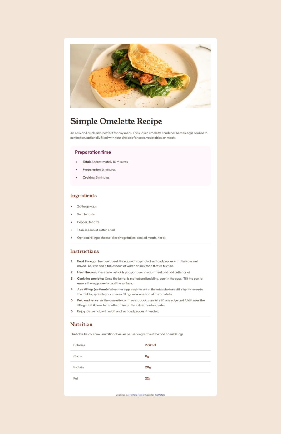
Not Found
Not Found
Not Found
Not Found
Not Found
Not Found
Not Found
Not Found
Not Found
Not Found
Not Found
Not Found
Not Found
Not Found
Not Found
Not Found
Not Found
Not Found
Not Found
Not Found

Submitted

Recipe page

@justasteri

Desktop design screenshot for the Recipe page coding challenge

This is a solution for...

  • HTML
  • CSS
1newbie
View challenge

Design comparison


SolutionDesign

Solution retrospective


What are you most proud of, and what would you do differently next time?

I am proud of finishing the project. There were some times and moments where I didn't know how to do something very specific, but after watching a long tutorial and google some issues, I was able to finish :)

I think something that I will do different would be avoiding perfectionism. This is because I try to make a perfect page, but this only caused a burnout on me and make me abandon the project during weeks.

What challenges did you encounter, and how did you overcome them?

  • Responsibe layout for mobiles
  • Trying to do pixel perfect layouts

Community feedback

P
Steven Stroud 11,810

@Stroudy

Posted

Exceptional work! You’re showing great skill here. I’ve got a couple of minor suggestions that could make this stand out even more…

  • Using a <main> tag inside the <body> of your HTML is a best practice because it clearly identifies the main content of your page. This helps with accessibility and improves how search engines understand your content.

  • Overusing <div> tags, known as "divitis," leads to cluttered code, poor semantics, and reduced performance. Instead, use appropriate semantic elements (like <header>, <section>, etc.) to improve readability, accessibility, and SEO. Keep HTML clean and minimal to ensure maintainability, scalability, and better CSS structure.

      <div class="recipe-card__omelette-img">
        <img src="./assets/images/image-omelette.jpeg" alt="Omelette" />
      </div>
  • Having a clear and descriptive alt text for images is important because it helps people who use screen readers understand the content, making your site more accessible. It also improves SEO, as search engines use alt text to understand the image's context, helping your site rank better, Check this out Write helpful Alt Text to describe images,
<img src="./assets/images/image-omelette.jpeg" alt="Omelette" />❌
<img src="./assets/images/image-omelette.jpeg" alt="A picture of a cooked Omelette" />✅
  • Using font-display: swap in your @font-face rule improves performance by showing fallback text until the custom font loads, preventing a blank screen (flash of invisible text). The downside is a brief flash when the font switches, but it’s usually better than waiting for text to appear.

  • While px is useful for precise, fixed sizing, such as border-width, border-radius, inline-padding, and <img> sizes, it has limitations. Pixels don't scale well with user settings or adapt to different devices, which can negatively impact accessibility and responsiveness. For example, using px for font sizes can make text harder to read on some screens, Check this article why font-size must NEVER be in pixels. In contrast, relative units like rem and adjust based on the user’s preferences and device settings, making your design more flexible and accessible. Use px where exact sizing is needed, but prefer relative units for scalable layouts. If you want a deeper explanation watch this video by Kevin Powell CSS em and rem explained. Another great resource I found useful is this px to rem converter based on the default font-size of 16 pixel.

body {
  font-size: 16px; }
  • I think you can benefit from using a naming convention like BEM (Block, Element, Modifier) is beneficial because it makes your CSS more organized, readable, and easier to maintain. BEM helps you clearly understand the purpose of each class, avoid naming conflicts, and create reusable components, leading to a more scalable codebase. For more details BEM,

  • Using rem or em units in @media queries is better than px because they are relative units that adapt to user settings, like their preferred font size. This makes your design more responsive and accessible, ensuring it looks good on different devices and respects user preferences.

@media screen and (max-width: 715px)

I hope you’re finding this guidance useful! Keep refining your skills and tackling new challenges with confidence. You’re making great progress—stay motivated and keep coding with enthusiasm! 💻

Marked as helpful

1

@justasteri

Posted

@Stroudy Hi! Thank you so much for the feedback! I really appreciate your suggestions. I tried to apply all of these comments in the project so that I can learn some new concepts or improve others.

1
P
Steven Stroud 11,810

@Stroudy

Posted

Hey @justasteri, You got this bro! Take your time experiment see how it works and why, Lets go! 💪

1

Please log in to post a comment

Log in with GitHub
Discord logo

Join our Discord community

Join thousands of Frontend Mentor community members taking the challenges, sharing resources, helping each other, and chatting about all things front-end!

Join our Discord