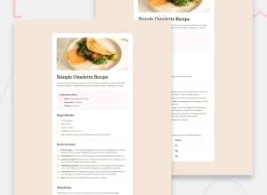
Design comparison
Community feedback
- @hannibal1631Posted 5 months ago
Good job on this project.
But there are certain things that can be better. For example the font-sizes and padding inside the container. Your font-sizes are way off, so take a look at that. The padding is also way less than the actual design. But don't worry about these, cause at first we all make mistakes. In the end what matters is what have you learned from your mistakes. Let's connect somewhere so we can work on some projects in future.Tell me where would you like to connect.
Marked as helpful0@amartadeviPosted 5 months ago@hannibal1631 Thank you for the constructive feedback! I appreciate you pointing out the areas that need improvement. I'll make sure to revisit the font sizes and padding to align them more closely with the actual design.
0@hannibal1631Posted 5 months ago@amartadevi I'm sure you'll get it right. Can we connect somewhere so we can work on some projects or discuss coding in future??
Marked as helpful0@amartadeviPosted 5 months ago@hannibal1631 Yes sure, You can reach me on LinkedIn https://www.linkedin.com/in/amarta-devi-a0a034294?lipi=urn%3Ali%3Apage%3Ad_flagship3_profile_view_base_contact_details%3BVAWmck5cRzaR3c093w2TcA%3D%3D
0
Please log in to post a comment
Log in with GitHubJoin our Discord community
Join thousands of Frontend Mentor community members taking the challenges, sharing resources, helping each other, and chatting about all things front-end!
Join our Discord
