

Design comparison

Solution retrospective
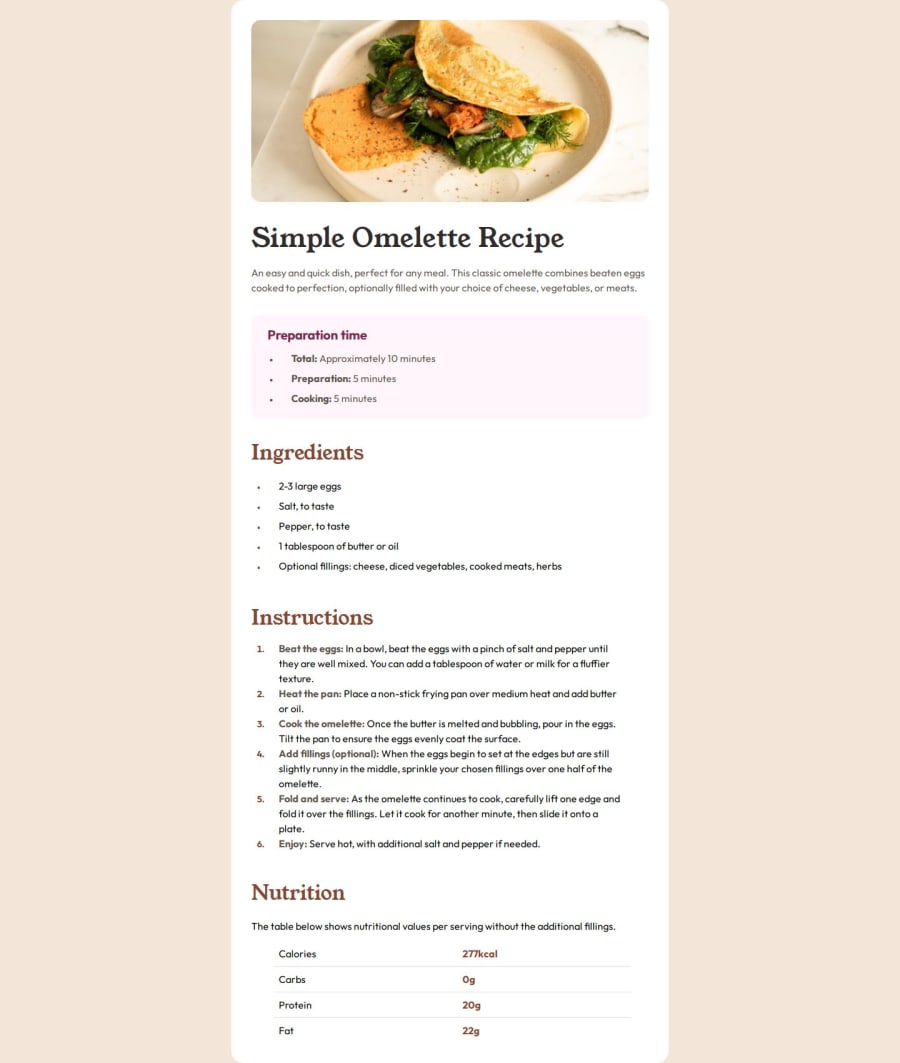
I just guessed the spacing, font-size, font-weight and colors. The image was very big because it was supposed to be a scrollable page therefore getting everything accurate and exact was quite difficult and having a figma design for such challenges would be very helpful in the future. Nevertheless I tried my best to use correct judgements about all the above mentioned things.
What challenges did you encounter, and how did you overcome them?Spacing (Margin and Padding) Font size Font weight Colors
What specific areas of your project would you like help with?I want to know if there is anything major which I am getting wrong and which could lead to a weak base if I continue that. Any such practice that I should change or any tip on how to style more efficiently. How to write less css
Community feedback
Please log in to post a comment
Log in with GitHubJoin our Discord community
Join thousands of Frontend Mentor community members taking the challenges, sharing resources, helping each other, and chatting about all things front-end!
Join our Discord