Solution retrospective
I think this went well. I want to give clients realistic timescales when I start doing paid work, I know this will come as I do more challenges.
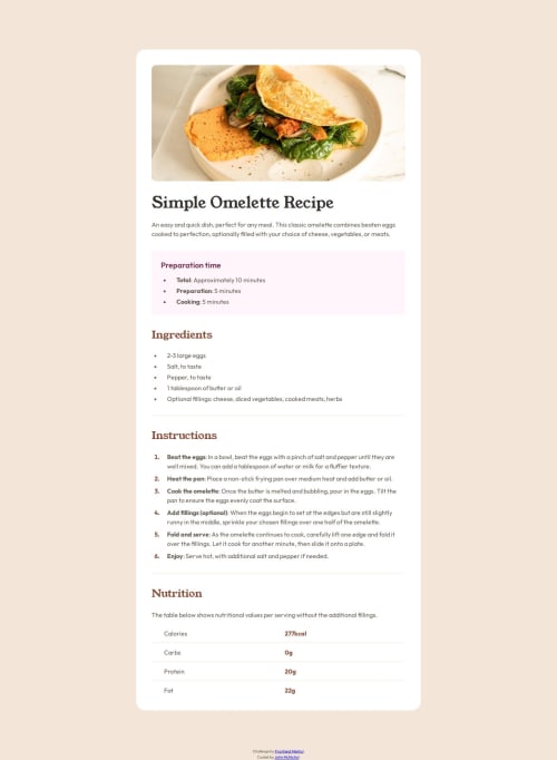
What challenges did you encounter, and how did you overcome them?I originally did the final section as a table and it turned out okay. I thought I would try it again with Flexbox and I preferred this approach because it is much more readable in the HTML and CSS.
What specific areas of your project would you like help with?Is there a preferred or right way when it comes to table-like content on a website in how to build it? Should it be in a table, CSS grid, Flexbox or other CSS framework, or does only the end result matter?
Please log in to post a comment
Log in with GitHubCommunity feedback
No feedback yet. Be the first to give feedback on John McNichol's solution.
Join our Discord community
Join thousands of Frontend Mentor community members taking the challenges, sharing resources, helping each other, and chatting about all things front-end!
Join our Discord