Solution retrospective
What are you most proud of, and what would you do differently next time?
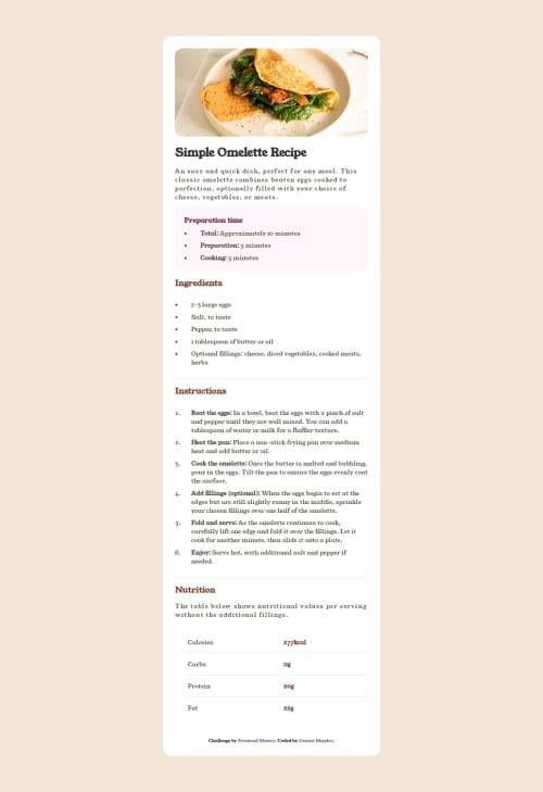
Busquei reproduzir o projeto o mais próximo do que pedido. Acrescentaria algumas animações.
What challenges did you encounter, and how did you overcome them?Organização da projeto sem ficar utilizando a div.
Code
Loading...
Please log in to post a comment
Log in with GitHubCommunity feedback
No feedback yet. Be the first to give feedback on osmar mendes's solution.
Join our Discord community
Join thousands of Frontend Mentor community members taking the challenges, sharing resources, helping each other, and chatting about all things front-end!
Join our Discord