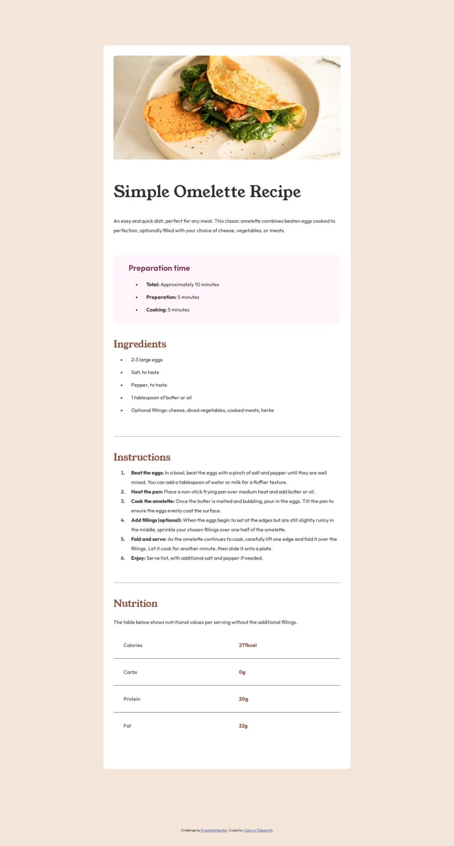
Design comparison
Solution retrospective
This was my first time writing my own media queries without a tutorial so I'm proud of that. Next time, I want to get more clear on which units (em, rem, %, vh, etc.) to use when for responsive design.
What challenges did you encounter, and how did you overcome them?I encountered a few new concepts in this project including using the HTML tag and making a slightly more complex responsive design. I used google and youtube to answer my questions.
What specific areas of your project would you like help with?Any tips on responsive design or more general constructive critiques are welcome!
Please log in to post a comment
Log in with GitHubCommunity feedback
- @AramHagen
Good job! I wanna recommend this approach for import the google font to your project
I learned how to use the
&symbol to import two fonts in my HTML(family=Outfit:wght@100..900&family=Young+Serif). I also learned that the<link>approach is faster and more efficient, while using@importin CSS introduces delays and additional requests.@import url('https://fonts.googleapis.com/css2?family=Outfit:wght@100..900&family=Young+Serif&display=swap'); in the CSS file.- Adding
<link rel="stylesheet" href="https://fonts.googleapis.com/css2?family=Outfit:wght@100..900&family=Young+Serif&display=swap" />to the<head>tag."
Join our Discord community
Join thousands of Frontend Mentor community members taking the challenges, sharing resources, helping each other, and chatting about all things front-end!
Join our Discord
