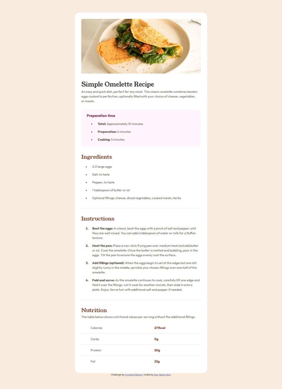
Design comparison
Solution retrospective
This one I really felt like I started to get into a flow around how to build things in css. Especially with the semantic hmtl. I don't think there is much I would change here.
What challenges did you encounter, and how did you overcome them?ran into a problem trying to move the list items away from their markers. figured it out quickly though.
What specific areas of your project would you like help with?Any feedback is great.
Community feedback
- @OscarRodolfoUMGPosted 5 months ago
It looks great, except that you have some larger spaces than in the view, that part of arranging the spacing, which in itself in Word is sometimes complicated in code, you end up searching on several pages how to arrange each thing, coincidentally it is the first challenge I did on this platform, when you can, stop by mine and leave me your feedback.
0
Please log in to post a comment
Log in with GitHubJoin our Discord community
Join thousands of Frontend Mentor community members taking the challenges, sharing resources, helping each other, and chatting about all things front-end!
Join our Discord
