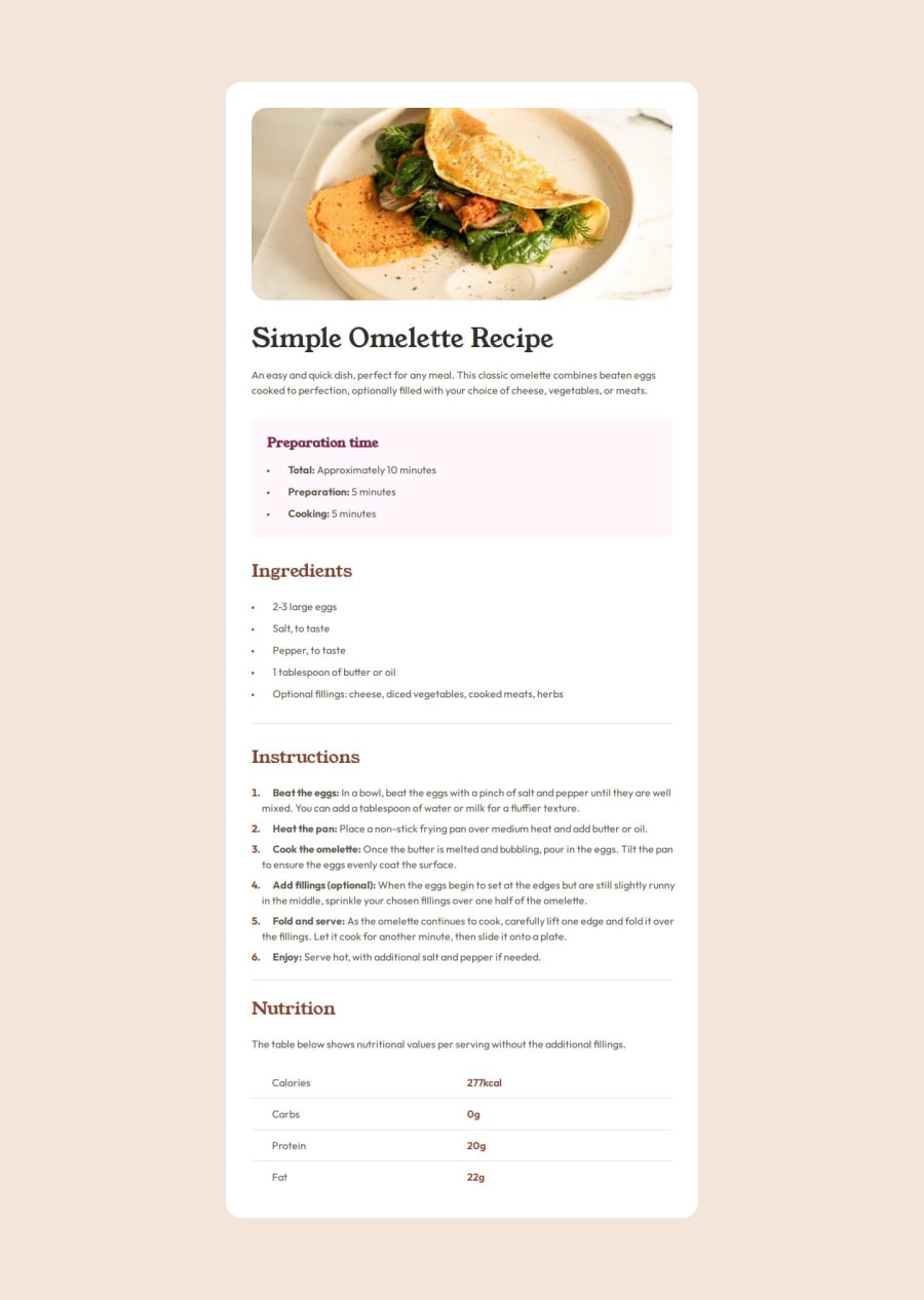


Design comparison

Solution retrospective
I am most proud of successfully implementing the Recipe Page with a well-structured and responsive layout. The use of CSS variables for consistent styling, semantic HTML elements, and a clean design closely matches the original challenge.
If I were to improve this project, I would:
- Enhance accessibility by ensuring better use of ARIA attributes where necessary.
- Optimize CSS structure by reducing redundant properties and ensuring better reusability.
- Improve responsiveness further by testing different screen sizes and refining spacing adjustments in smaller viewports.
- Challenge: Ensuring that wrapped text in
<li>items aligns properly with the first line. - Solution: Used
list-style-position: inside;along withpadding-leftandposition: relative;for precise indentation.
- Challenge: Keeping the nutrition table well-aligned with proper spacing and borders.
- Solution: Used
border-collapse: collapse;andtr:not(:last-child) { border-bottom: 1px solid var(--stone-150); }to achieve a clean look.
- Challenge: Balancing the contrast between headers, paragraphs, and values while keeping readability high.
- Solution: Applied a consistent font hierarchy, using "Young Serif" for headings and "Outfit" for the body text.
I would appreciate feedback on the following areas:
-
CSS Optimization & Maintainability:
- Are there ways to simplify or optimize my CSS rules for better maintainability?
- Would using a CSS framework (like TailwindCSS or SCSS mixins) improve efficiency?
-
Accessibility Enhancements:
- Are there any ARIA improvements I should make to improve screen reader usability?
- Should I add more semantic elements (e.g.,
<section>vs<div>) for better structure?
-
Responsive Design & Mobile Experience:
- How can I further refine responsiveness, especially on very small screens?
- Would using
clamp()orflex-wrapin more places help?
Any suggestions or feedback would be highly appreciated! 🚀😊
Community feedback
- @rukhulkiromPosted about 2 months ago
-
The padding in the .text-content section (40px 32px) might be excessive on smaller screens. Consider using padding: 5vw; for better responsiveness.
-
The list item markers (::marker) are currently styled at 12px in <ul> but 16px in <ol>. This might be inconsistent with the intended design.
Overall, this is a well-structured and visually appealing solution! With minor accessibility and responsiveness improvements, it would be even stronger.
0 -

Please log in to post a comment
Log in with GitHub
Join our Discord community
Join thousands of Frontend Mentor community members taking the challenges, sharing resources, helping each other, and chatting about all things front-end!
Join our Discord