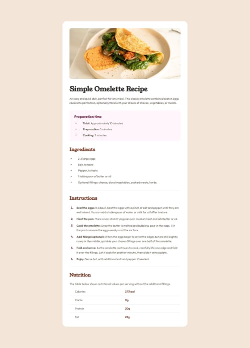
Solution retrospective
Throughout this project I tried to use semantic HTML elements where possible. Initially I was assigning class names to most elements, but I later found it easier to apply styling to more elements at once by targeting elements instead of many different classes. As a result, I only assigned classes to elements that I needed to specifically target. This made my CSS shorter as a result, but it also created a section in my CSS where I used elements selectors to apply styling to similar elements instead of typically targeting elements through classes. Any feedback or suggestions on my use of semantic elements and/or use of classes would be appreciated.
One of the trickiest parts of this challenge for me was figuring out how to get the correct spacing around content, particularly around the lists, lists items, and markers. I ended up wrapping list items in span elements, and using list-style-position, position, padding and indent properties to match the design image. However, I sometimes found things such as the horizontal alignment of list item content and the text indent starting position of wrapping text became problematic and required more effort to control. I'm keen to hear any thoughts on ways I could have done this more easily, and without the additional effects I then had to figure out how to control. I may have made this harder than it needed to be.
When it came to the nutrition section I used several child selectors to get the spacing, borders, and colours working properly. Again any feedback on how I did this, or tips on how I could do this better next time, would be appreciated.
Lastly, I used media queries to recreate the mobile design but I am still very new to using these. Any advice for how I could improve here would be helpful.
Thank you in advance.
Please log in to post a comment
Log in with GitHubCommunity feedback
No feedback yet. Be the first to give feedback on Rory McPherson's solution.
Join our Discord community
Join thousands of Frontend Mentor community members taking the challenges, sharing resources, helping each other, and chatting about all things front-end!
Join our Discord