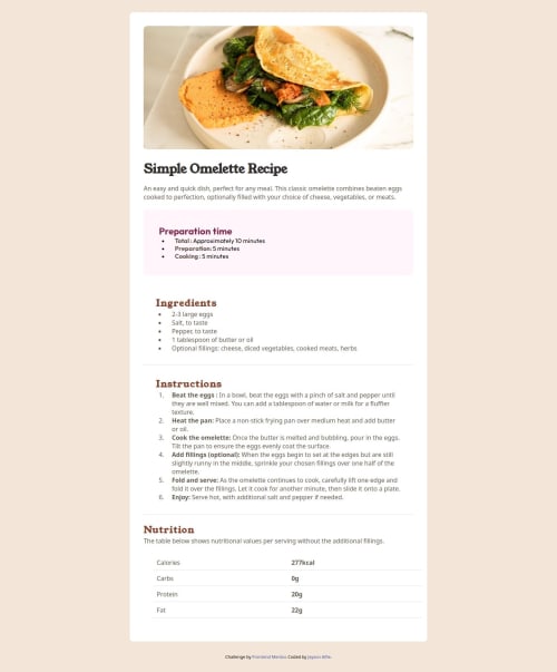
Design comparison
Solution retrospective
Well I am proud that I had a chance to refresh on using react after a while but still working on grasping the content so that at one point in time I may code without referring.
What challenges did you encounter, and how did you overcome them?Styling various components and also following the mobile first approach when it comes to designing the page.
What specific areas of your project would you like help with?Any styling guides and paths to follow in the mobile first approach would be appreciated.
Community feedback
- @TedJenklerPosted 3 months ago
Hi @jaysonalfie,
Nice project! I have a few suggestions to help improve your code:
Semantic HTML: I noticed that you're missing some semantic elements. Consider adding <main>, <section>, or <article> to replace <div> elements where applicable to enhance accessibility. In React, you can also reduce the number of <div> tags and make your code cleaner by using <></> (React fragments). This can help make your frontend code more readable and clean.
Bundler: I also noticed you're using CRA (Create React App). While it’s a common tool for React projects, it hasn’t been updated since 2021. I would recommend switching to Vite as it's easier to learn, faster, and more efficient for modern React projects. Alternatively, you can also explore Webpack, which is more customizable if you want more control over your bundling process.
Keep up the great work!
Best, Teodor
Marked as helpful2@jaysonalfiePosted 3 months ago@TedJenkler Much thanks for the feedback. I truly appreciate. Let me work on it and also do research on Vite. Thanks
1@jaysonalfiePosted 3 months ago@TedJenkler Much thanks for the feedback. I truly appreciate. Let me work on it and also do research on Vite. Thanks
0 - @StroudyPosted 3 months ago
Hey love the solution, something I noticed,
- Setting a height and width attribute to your
<img>
will increase performance to reduce layout shifts and improve CLS, It reserves the space on the page for the image, - These
px
values would be better inrem
orem
like the rest of your code,
ol { list-style: initial; margin-left: 15px; padding-left: 10px; } @media only screen and (min-width: 375px)
- Having better
alt=""
descriptions for accessibility is a must check this out Write helpful Alt Text to describe images, - You should apply a full modern reset to make things easier as you build, check out this site for a Full modern reset,
- Check out this article from a Frontend mentor dev about responsive-meaning.
Hope some of this information is helpful, I look forward to seeing more from you, Happy coding!
Marked as helpful0@jaysonalfiePosted 3 months ago@Stroudy Much thanks for the insight I truly appreciate
1@StroudyPosted 3 months ago@jaysonalfie No problem, Knowledge past on to me and I want to share because it helped me <3 Good luck, hope to see some more from you.
Marked as helpful1 - Setting a height and width attribute to your
Please log in to post a comment
Log in with GitHubJoin our Discord community
Join thousands of Frontend Mentor community members taking the challenges, sharing resources, helping each other, and chatting about all things front-end!
Join our Discord