Not Found
Not Found
Not Found
Not Found
Not Found
Not Found
Not Found
Not Found
Not Found
Not Found
Not Found
Not Found
Not Found
Not Found
Not Found
Not Found
Not Found
Not Found
Not Found
Not Found
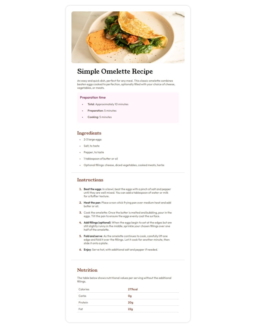
Desktop design screenshot for the Recipe page coding challenge

This is a solution for...

  • HTML
  • CSS
1newbie
View challenge

Design comparison


SolutionDesign

Solution retrospective


What are you most proud of, and what would you do differently next time?

You can implement it according to the design, but it looks like there are several things that need to be improved

What challenges did you encounter, and how did you overcome them?

I'm a little confused about what I should apply in the nutrition section

What specific areas of your project would you like help with?

in the nutrition section, whether to use flex or grid and I'm still confused about the best practice for applying bem

Community feedback

P

@Fable54321

Posted

1 -html wise, this looks spot on to me, I really should start using the bem convention more, very clean.

2- Now in your css, I can see you have used rem for font-sizes, wich I know a lot of people like to. If you do so it is really important to convert properly. You have a given paragraph size of 16px, that means I should see font-size: 1 rem somewhere, but it isn't there.

3-You have imported the young serif font, but never used it. The style guide can be seen as some sort of checklist to see if anything is missing at the end.

4-more on font-families, your font-family: "Outfit" is there 6 times. Now I'm all for interchangeable code in the future, but surely calling it on every single block is overkill. You could maybe look at css variables, have let's say a primary one and a secondary one that are both Outfit, use one of each variables for two different sectiosn and then if in the future, let's says the ingredients font needs to change you can just change the associated variable .

5-The colors look right at a glance. Except for the background wich I think you just forgot, no big deal.

6-It's not the end of the world for this project, but for the future you can use a display:flex and an align-items: center on the body to center your project vertically. For this your body needs a min-height: 100vh, wich I personally put on every project.

7- The responsiveness looks good, I would suggest you to use em for your media queries, they're the most consistent across all browsers. (50em is a good spot to start and see how it looks).

Overall Good job ! Keep up !

Marked as helpful

1

@riddsep

Posted

@Fable54321 woah, very good advice. Thank you bro for your advice, I'm happy with it

1
ِAhmed 530

@Axsel519

Posted

Everything is great

But I think you forgot the background color for the body element

Marked as helpful

0

@riddsep

Posted

@Axsel519 Try checking the preview side, mate, I've fixed it,thanks for your attention!

0
Sherzod 170

@SherzodToshpulatov

Posted

Looks good! In the nutrition section, you can use Table.

Marked as helpful

0

@riddsep

Posted

@SherzodToshpulatov I was a little confused about whether to use flex grid or table, thanks mate!

0

Please log in to post a comment

Log in with GitHub
Discord logo

Join our Discord community

Join thousands of Frontend Mentor community members taking the challenges, sharing resources, helping each other, and chatting about all things front-end!

Join our Discord