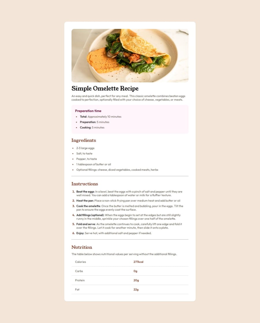
Design comparison
Solution retrospective
i found thist challenge more difficult than the previous one, but i managed to complete it.
What specific areas of your project would you like help with?I didn't understand why I had to modify only the widht element of my container item
Community feedback
- @AbimzzPosted 8 months ago
First and foremost, I want to commend you on the excellent job you've done with the site! The styling of the list markers is particularly impressive. I found it to be visually appealing and well-executed. Your example has provided me with valuable insights that I can apply to my own code, so thank you for that!
Areas for Improvement While the site has many strengths, I did notice a few areas that could benefit from some adjustments:
-
Card Padding and Max-Width
- The padding for the card elements appears to be a bit too large, which can affect the overall layout and spacing. Reducing the padding could create a more balanced look.
- Additionally, the max-width of the cards seems somewhat small. Increasing this value could enhance the visual impact and usability of the cards, allowing for better content display.
-
Mobile Responsiveness
- One significant issue is the lack of a mobile view. On smaller screens, the layout becomes disorganized, which can detract from the user experience. Implementing media queries will be essential in addressing this. By defining different styles for various screen sizes, you can ensure that the site remains user-friendly and visually appealing across all devices.
Overall, your work is commendable, and with a few adjustments, it can be even better. I appreciate the effort you've put into this project, and I look forward to seeing how you implement these changes. Keep up the great work!
Marked as helpful1@ivan-josefPosted 8 months ago@Abimzz Thank you very much, I will try to improve these points you said right now and I agree one hundred percent
0@ivan-josefPosted 8 months ago@Abimzz Abusing your good will a little, why does my solution have this white part at the bottom?
0 -
Please log in to post a comment
Log in with GitHubJoin our Discord community
Join thousands of Frontend Mentor community members taking the challenges, sharing resources, helping each other, and chatting about all things front-end!
Join our Discord
