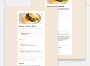
Design comparison
Please log in to post a comment
Log in with GitHubCommunity feedback
- P@Stroudy
Hey, Great solution, You should be proud, You’re really nailing it. Just a few things I noticed that could make it even better…
-
In your
<ol>and<ul>you have wrapped the text in a<p>, You dont need to do this as the<li>tag has already gave it semantic meaning, Screen readers have a specific way of announcing lists. Ensuring proper list structure aids screen reader output. -
remis better thanpxfor margins and padding because it scales with the root font size, ensuring consistent spacing and responsiveness across different devices and user settings. -
Line height is usually unitless to scale proportionally with the font size, keeping text readable across different devices. Best practice is to use a unitless value like
1.5for flexibility. Avoid using fixed units likepxor%, as they don't adapt well to changes in font size or layout.
Great job taking the time to learn! Your efforts are paying off, and I hope these insights guide you to even more success. Keep pushing forward, and remember, you’ve got this! Enjoy your coding adventures! 💪
Marked as helpful -
Join our Discord community
Join thousands of Frontend Mentor community members taking the challenges, sharing resources, helping each other, and chatting about all things front-end!
Join our Discord
