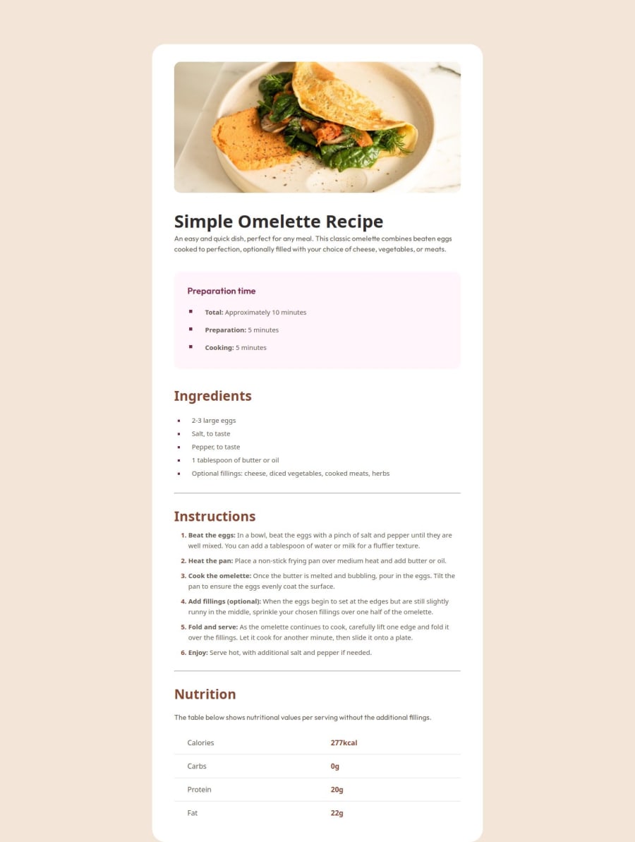
Design comparison
SolutionDesign
Solution retrospective
What are you most proud of, and what would you do differently next time?
Found a solution to create a mobile page by adding an additional div to style it. Feels a bit awkward building the desktop and then mobile one.
What challenges did you encounter, and how did you overcome them?Styling the mobile version after doing the desktop one. I thought about the solution a few days and it turned out it was an easy, 2-minute thing. :)
What specific areas of your project would you like help with?I think I need more help with the strategy, how to tackle the project rather than smaller, technical things.
Community feedback
Please log in to post a comment
Log in with GitHubJoin our Discord community
Join thousands of Frontend Mentor community members taking the challenges, sharing resources, helping each other, and chatting about all things front-end!
Join our Discord
