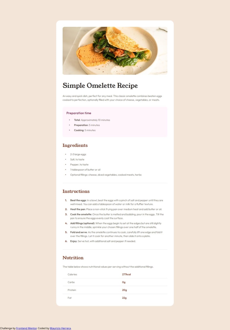
Design comparison
Solution retrospective
It was kind of hard dealing with all the styling for the lists and tables since a lot of it was custom this time around. I went down a rabbit whole trying to make the bullets and numbers to be inside the elements because I wanted them to be aligned with the rest of the items in the page but it turned out to be a waste of time since they had to be custom anyway.
What challenges did you encounter, and how did you overcome them?Biggest challenge was dealing with custom list items and making sure that they behaved like tables as well as responsiveness as I hadn't work with it before.
Please log in to post a comment
Log in with GitHubCommunity feedback
- @vivanchauhan
great going mate pretty close to the original design.
Join our Discord community
Join thousands of Frontend Mentor community members taking the challenges, sharing resources, helping each other, and chatting about all things front-end!
Join our Discord
