Design comparison
Please log in to post a comment
Log in with GitHubCommunity feedback
- @neirucode
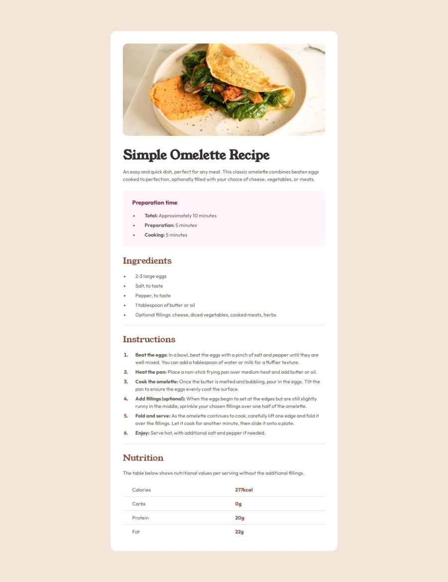
I can see a lot of thought went into the structure and styling of the recipe page. I like how you've used semantic HTML elements like <ul>, <ol>, and <table>, which make the content easy to read and accessible. The #main-container is well-centered, and the use of flexbox for aligning items shows good control over layout.
A couple of things I noticed that might be worth tweaking as you continue:
Font Preloads: You’ve included multiple preconnect tags for Google Fonts, which helps performance. You could consider combining the fonts in a single link element to reduce the number of HTTP requests.
HR Styling: The hr element is almost invisible due to the very light color. It might be worth giving it a slightly darker shade or more prominence, especially since it helps separate sections.
Responsiveness: The mobile responsiveness is coming along nicely. The only thing I’d suggest is paying a little more attention to padding and margin at smaller screen sizes. For example, the margin around #main-container gets removed on smaller screens, which makes it feel a bit cramped. Maybe add a small margin for better breathing room.
Consistent Font Sizes: The font sizes, particularly for headings, could be standardized or varied more intentionally. For instance, the font size of #title is quite large compared to other text, which might overwhelm smaller screens. Consider reducing the size for smaller devices in your media query.
Color Choices: The color scheme is warm and inviting, though some colors (like hsl(330, 100%, 98%) for the #preparation background) are quite light and may not provide enough contrast for readability. Increasing the contrast just a bit might improve legibility.
Overall, this is a great project that demonstrates solid frontend skills. As you refine the code and tweak minor details, I think you'll end up with a highly polished, professional-looking recipe page. Great work!
Join our Discord community
Join thousands of Frontend Mentor community members taking the challenges, sharing resources, helping each other, and chatting about all things front-end!
Join our Discord
