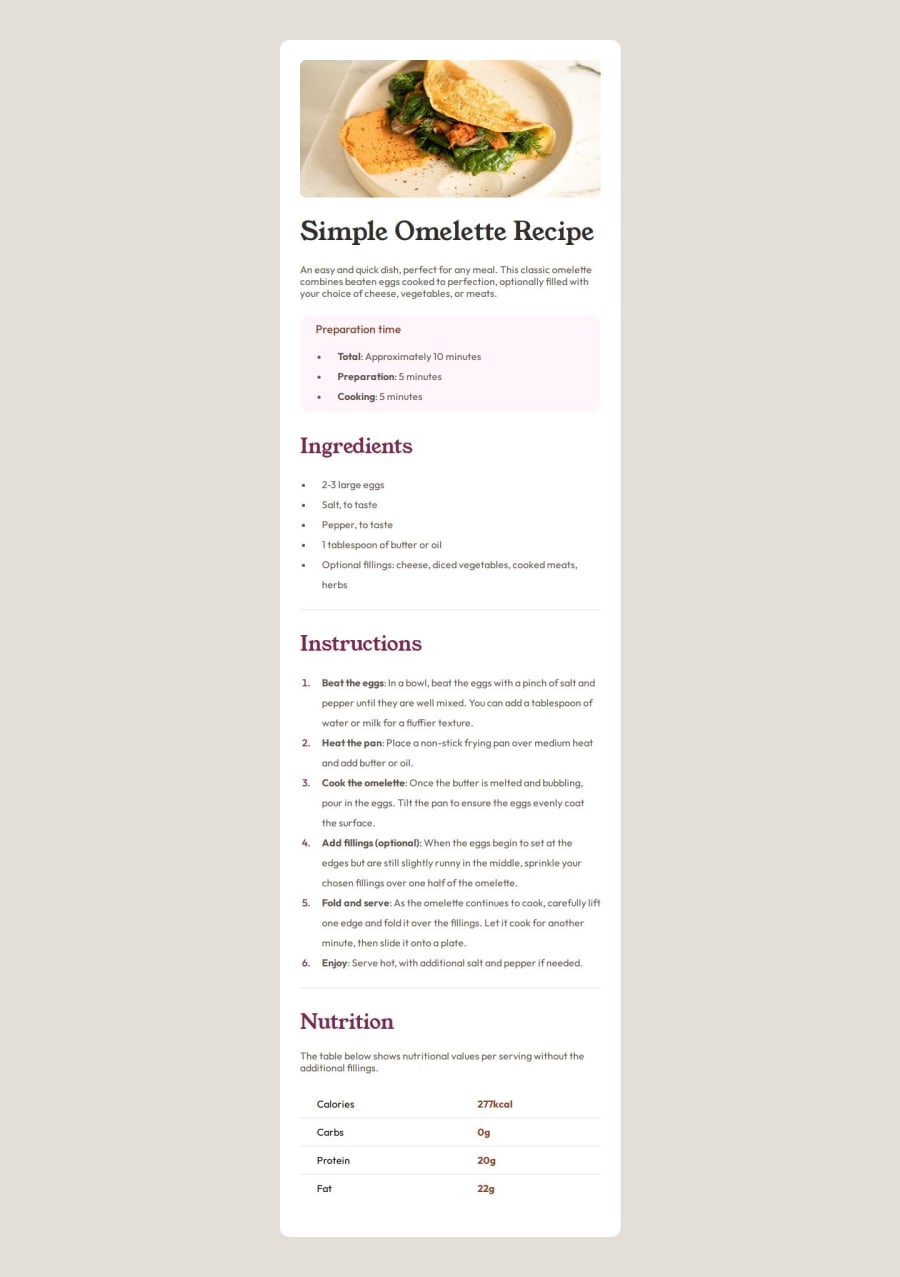
Design comparison
Community feedback
- @UnifiesPosted 5 months ago
Hi Mohamed, great work completing this Challenge!
Here's some feedback for better code optimization and :-
Keep an eye out for the accessibility report that's generated after you submit your solution - it gives us pointers on best practices that make our code accessible to all users such as including Semantic HTML in our code -->
<nav>,<header>,<main><section></section></main>,<footer>. The 'Learn more' on each warning in the report gives further explanation on why and how we should use these.Great work replicating the design as exact as possible - paddings, margin, fonts, sizes. Thumbs up! The colors for the design on some elements look a tad bit off though [body background color, some li marker colors, and the headings]. Keep a close eye on the given design to see the differences such as the body bg-color actually being
--Stone-100and not--Stone-150.Marked as helpful0
Please log in to post a comment
Log in with GitHubJoin our Discord community
Join thousands of Frontend Mentor community members taking the challenges, sharing resources, helping each other, and chatting about all things front-end!
Join our Discord
