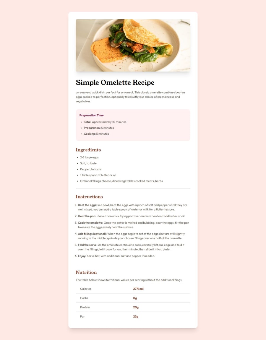
Design comparison
Solution retrospective
Learned about table management and small screens
Please log in to post a comment
Log in with GitHubCommunity feedback
- P@MikDra1
Well done, here are some things to review:
- The comments could benefit from additional context to explain the purpose of specific styles and decisions.
- There are redundant properties and values, like
--tw-border-spacing-xand--tw-border-spacing-y, which are defined but not used in this snippet. - Utility classes like
.text-2xland.font-boldmight conflict with existing styles, potentially leading to unexpected overrides. - Some CSS rules have low specificity, such as those for
hrandsmall, which might get overridden by more specific selectors elsewhere. - Combining base resets and utility classes in one snippet may not be ideal; separating these could improve maintainability.
- Defining numerous utility classes can increase the CSS file size, which might impact development performance despite Tailwind CSS’s PurgeCSS.
- Custom styles, like removing default button styles, might affect accessibility if not handled properly, so care should be taken to ensure usability.
- Some properties, like
-moz-ui-invalid, might be deprecated or have limited browser support, so checking for current standards is recommended. - Maintaining this CSS could become challenging as the project grows, suggesting a more modular approach or leveraging Tailwind’s configuration for large projects might be beneficial.
Hope you found this comment helpful 💗💗💗
Good job and keep going 😁😊😉
Marked as helpful - P@Stroudy
👨💻Hello fellow coder, Hope your well, Its great to see you seeking for knowledge, Few things here..
-
Using multiple
<h1>tags is bad practice because it confuses screen readers, impacts SEO by diluting the main topic, and disrupts the content hierarchy, making it harder for users and search engines to understand the page's structure. Typically there should only be one<h1>. -
Correct typos in the content to ensure clarity. For example,
Preeparationshould bePreparationreceipeimageshould berecipe imageandteh oanshould bethe pan. -
Improve the accessibility of the image element by providing meaningful alt text that describes the image content. Having a clear and descriptive
alttext for images is important because it helps people who use screen readers understand the content, making your site more accessible. It also improves SEO, as search engines usealttext to understand the image's context, helping your site rank better, Check this out Write helpful Alt Text to describe images, -
Keep your code neat by using consistent indentation, I recommend using a plugin called Prettier < Click here to see,
-
You as a developers should avoid using pixels (
px) because they are a fixed size and don't scale well on different devices. Instead, useremorem, which are relative units that adjust based on user settings, making your design more flexible, responsive, and accessible. For more information check out this, Why font-size must NEVER be in pixels or this video by Kevin Powell CSS em and rem explained.- Another great resource for px to rem converter.
I’m thrilled you’re finding this advice helpful! You’re doing an amazing job, so keep up the hard work. Remember, every line of code is a step closer to mastery. Stay motivated and keep coding! 🎉
Marked as helpful -
Join our Discord community
Join thousands of Frontend Mentor community members taking the challenges, sharing resources, helping each other, and chatting about all things front-end!
Join our Discord
