Design comparison
Solution retrospective
For the next time, I want to use a more standard nomenclature and utilize terms like 'container,' 'wrapper,' etc., instead of employing more specific terms.
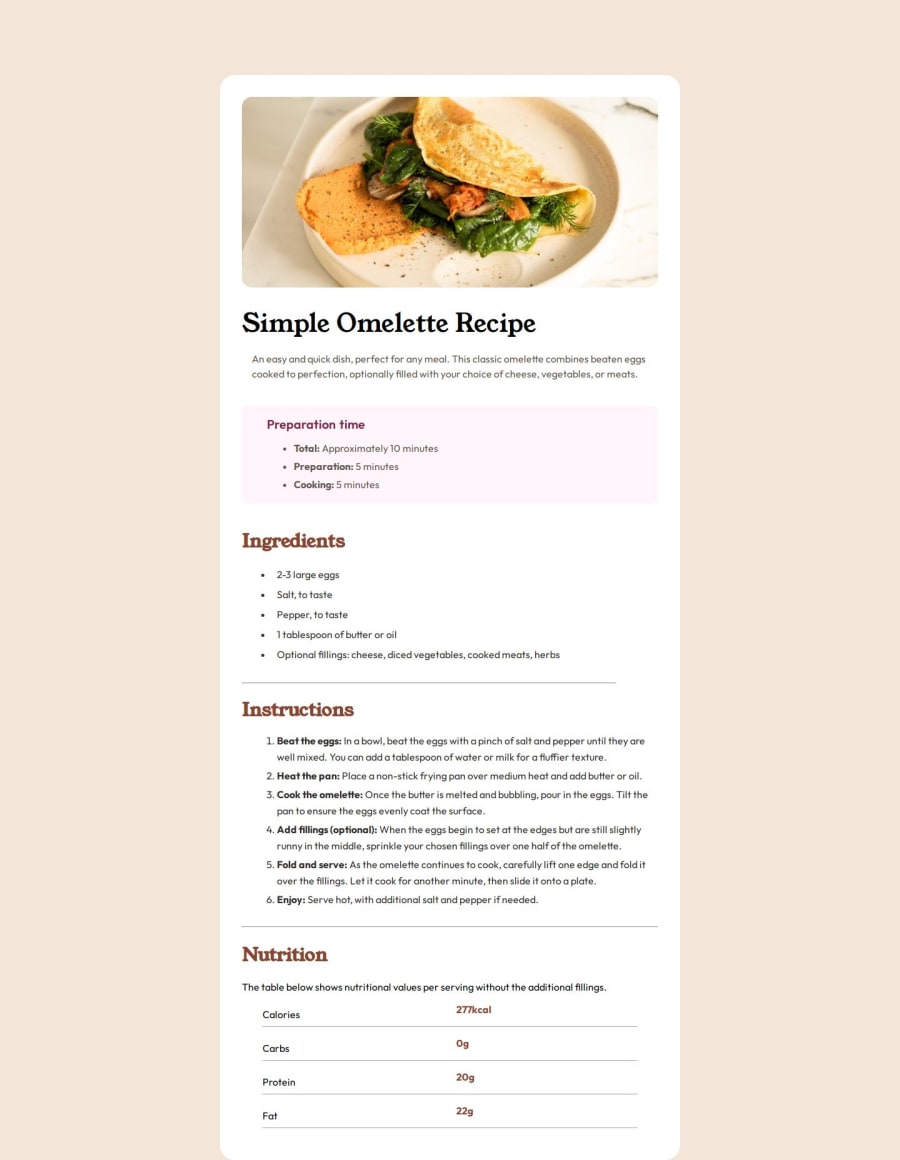
What challenges did you encounter, and how did you overcome them?It has been quite difficult to position the image so that it appears aligned with the original design on the comparison screen. I'm not sure what could be causing that issue. At the last minute, I had to change 'height: 100vh' to '100%' to make it fit on the screen.
What specific areas of your project would you like help with?It has been quite difficult to position the image so that it appears aligned with the original design on the comparison screen. I'm not sure what could be causing that issue. At the last minute, I had to change 'height: 100vh' to '100%' to make it fit on the screen.
Community feedback
- @stefan-holmgrenPosted 8 months ago
Really nice :)
I noticed a slight imperfection though in mobile view - there's a margin to the right side of the browser there, but other than that: stellar work!
Marked as helpful0
Please log in to post a comment
Log in with GitHubJoin our Discord community
Join thousands of Frontend Mentor community members taking the challenges, sharing resources, helping each other, and chatting about all things front-end!
Join our Discord
