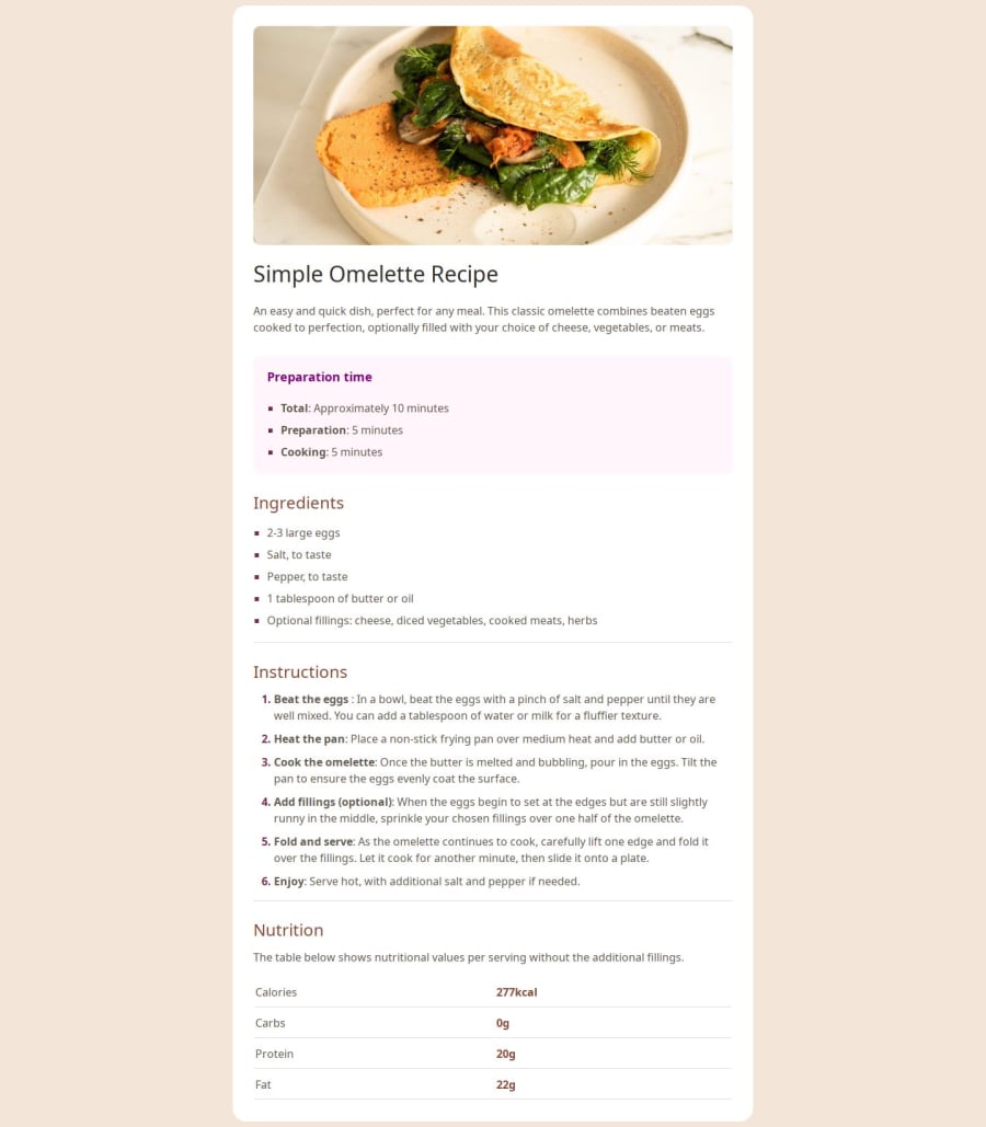
Design comparison
SolutionDesign
Solution retrospective
What are you most proud of, and what would you do differently next time?
I'm proud of making it look good and I would personalize the website next time.
What challenges did you encounter, and how did you overcome them?I had a lot of trouble with the lists and tables, but I did my research and reworked them.
What specific areas of your project would you like help with?I still want to know how to change the mobile capability and also learn about the unordered list dots.
Please log in to post a comment
Log in with GitHubCommunity feedback
No feedback yet. Be the first to give feedback on 4rd2's solution.
Join our Discord community
Join thousands of Frontend Mentor community members taking the challenges, sharing resources, helping each other, and chatting about all things front-end!
Join our Discord
