Solution retrospective
What are you most proud of, and what would you do differently next time?
I am most proud of how the page seamlessly transitions from mobile to desktop.
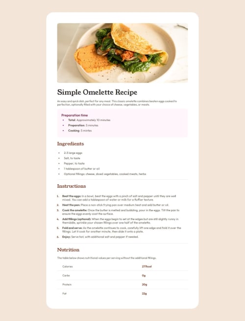
What challenges did you encounter, and how did you overcome them?Creating the Nutrition table was challenging because I needed to create lines went across the entire page for each value except for the last value. I achieved this by putting a bottom border in each table entry and then for the last value manually changing the style in the html file to have no border.
Code
Loading...
Please log in to post a comment
Log in with GitHubCommunity feedback
No feedback yet. Be the first to give feedback on matt2282's solution.
Join our Discord community
Join thousands of Frontend Mentor community members taking the challenges, sharing resources, helping each other, and chatting about all things front-end!
Join our Discord