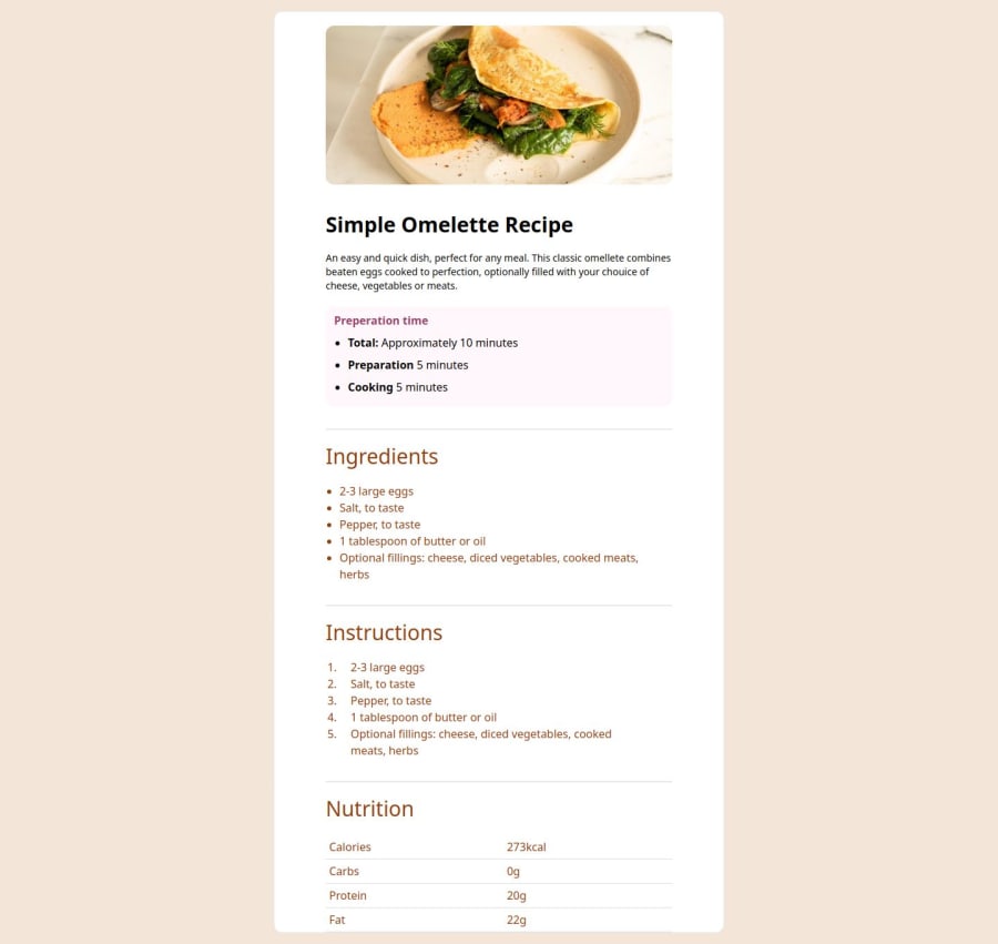
Design comparison
SolutionDesign
Solution retrospective
What are you most proud of, and what would you do differently next time?
tried using tailwind which was an interesting experience, slowly getting more accustomed to it
What challenges did you encounter, and how did you overcome them?getting used to tailwind
What specific areas of your project would you like help with?needed free figma to make it more like design :(
Community feedback
- @tatasadiPosted 3 months ago
Great effort on completing this challenge! Here are a few suggestions to improve your solution:
- Avoid using
h-full
, and opt formin-h-screen
instead. This ensures the content adapts better on devices where the height may exceed the viewport, preventing overflow issues. - It's better not to set fixed widths for your containers. Instead, use flexible units like
max-w-full
or percentages, which will make your layout more adaptable across different screen sizes. - Try to avoid using
<table>
for layout purposes. A CSS grid provides more flexibility and allows for better control of your content's structure, especially when adjusting to different screen sizes. - It seems the design isn't optimized for mobile. Consider using Tailwind's media queries (
sm:
,md:
, etc.) to make your design responsive. Responsive design is essential for ensuring that your layout works well on all devices, so it may help to dig deeper into responsive techniques.
0 - Avoid using
Please log in to post a comment
Log in with GitHubJoin our Discord community
Join thousands of Frontend Mentor community members taking the challenges, sharing resources, helping each other, and chatting about all things front-end!
Join our Discord