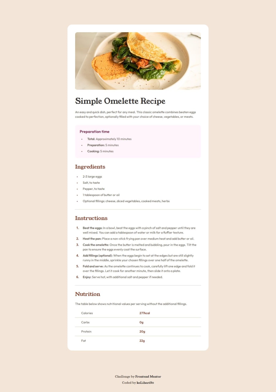
Not Found
Not Found
Not Found
Not Found
Not Found
Not Found
Not Found
Not Found
Not Found
Not Found
Not Found
Not Found
Not Found
Not Found
Not Found
Not Found
Not Found
Not Found
Not Found
Not Found

Submitted

Recipe page

P
kaLihaRi 50

@kalihari90

Desktop design screenshot for the Recipe page coding challenge

This is a solution for...

  • HTML
  • CSS
1newbie
View challenge

Design comparison


SolutionDesign

Solution retrospective


What are you most proud of, and what would you do differently next time?

I've learnt to better plan and organise my code. I'm proud that I can easily find info especially about spacing and sizes of the divs in Figma file.

What challenges did you encounter, and how did you overcome them?

Biggest challenge was the mobile version, especially spacing ordered list. There was a lot of media queries on the mobile, but that's the cost of the desktop-first approach, which I prefer.

Mobile version media queries:

@media (max-width: 375px) {
	.container {
		max-width: 100%;
		margin: 0;
	}
	.card {
		margin-block: 0;
		border-radius: 0;
		padding: 0;
		gap: 0;
	}

	.top-image {
		height: 17.1rem;
		border-radius: 0;
	}

	.text-content {
		padding: 4rem 3.2rem;
	}

	h1 {
		font-size: 3.6rem;
	}

	.attribution {
		margin-top: 4rem;
	}

	.instructions ol {
		gap: 0.8rem;
	}

	.instructions span {
		padding-left: 1.6rem;
	}

	ol {
		list-style-position: outside;
		margin-left: 1rem;
	}

	li {
		padding-left: 2.4rem;
	}
}

What specific areas of your project would you like help with?

I'm not sure margin-left: 1rem; on the mobile ol is correct, when I use list-style-position: outside; but it works.

Community feedback

@DylandeBruijn

Posted

@kalihari90

Hiya! 👋

Congratulations on your solution, it looks very close to the design! I can tell you put a lot of effort into it.

Things I like about your solution 🎉

  • Use of CSS custom properties

Things you could improve ✍️

  • Try experimenting with the CSS layout tool Flexbox, it will help you greatly structuring elements on your webpage.

  • You could add a min-height: 100vh to your body element so it takes up the full height of the viewport while still being able to grow when the content inside it grows.

  • Try using semantic HTML elements like main, section and article.

  • Try structuring your nutrition table using actual table, tr, td and th elements.

  • Even though you prefer a desktop first approach I recommend working mobile first. It helps you making your solution responsive writing a lot less code.

  • I recommend not setting a fixed height on your image. At the moment it warps when the viewport gets smaller. Leaving the height at auto is fine in my opinion.

I hope you find my feedback helpful! 🌟

Let me know if you have more questions and I'll do my best to answer them. 🙋‍♂️

Happy coding! 😎

Marked as helpful

0

Please log in to post a comment

Log in with GitHub
Discord logo

Join our Discord community

Join thousands of Frontend Mentor community members taking the challenges, sharing resources, helping each other, and chatting about all things front-end!

Join our Discord