Solution retrospective
What specific areas of your project would you like help with?
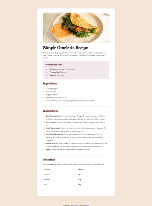
On the design itself the list bullet points are aligned with the list text. If anyone has any tips on how to do that please help me out. Perhaps it's a simple fix, but I didn't figure it out :(
Code
Loading...
Please log in to post a comment
Log in with GitHubCommunity feedback
No feedback yet. Be the first to give feedback on denise's solution.
Join our Discord community
Join thousands of Frontend Mentor community members taking the challenges, sharing resources, helping each other, and chatting about all things front-end!
Join our Discord