

Design comparison

Community feedback
- P@StroudyPosted 6 months ago
Exceptional work! You’re showing great skill here. I’ve got a couple of minor suggestions that could make this stand out even more…
- Overusing
<div>tags, known as "divitis," leads to cluttered code, poor semantics, and reduced performance. Instead, use appropriate semantic elements (like<header>,<section>, etc.) to improve readability, accessibility, and SEO. Keep HTML clean and minimal to ensure maintainability, scalability, and better CSS structure.
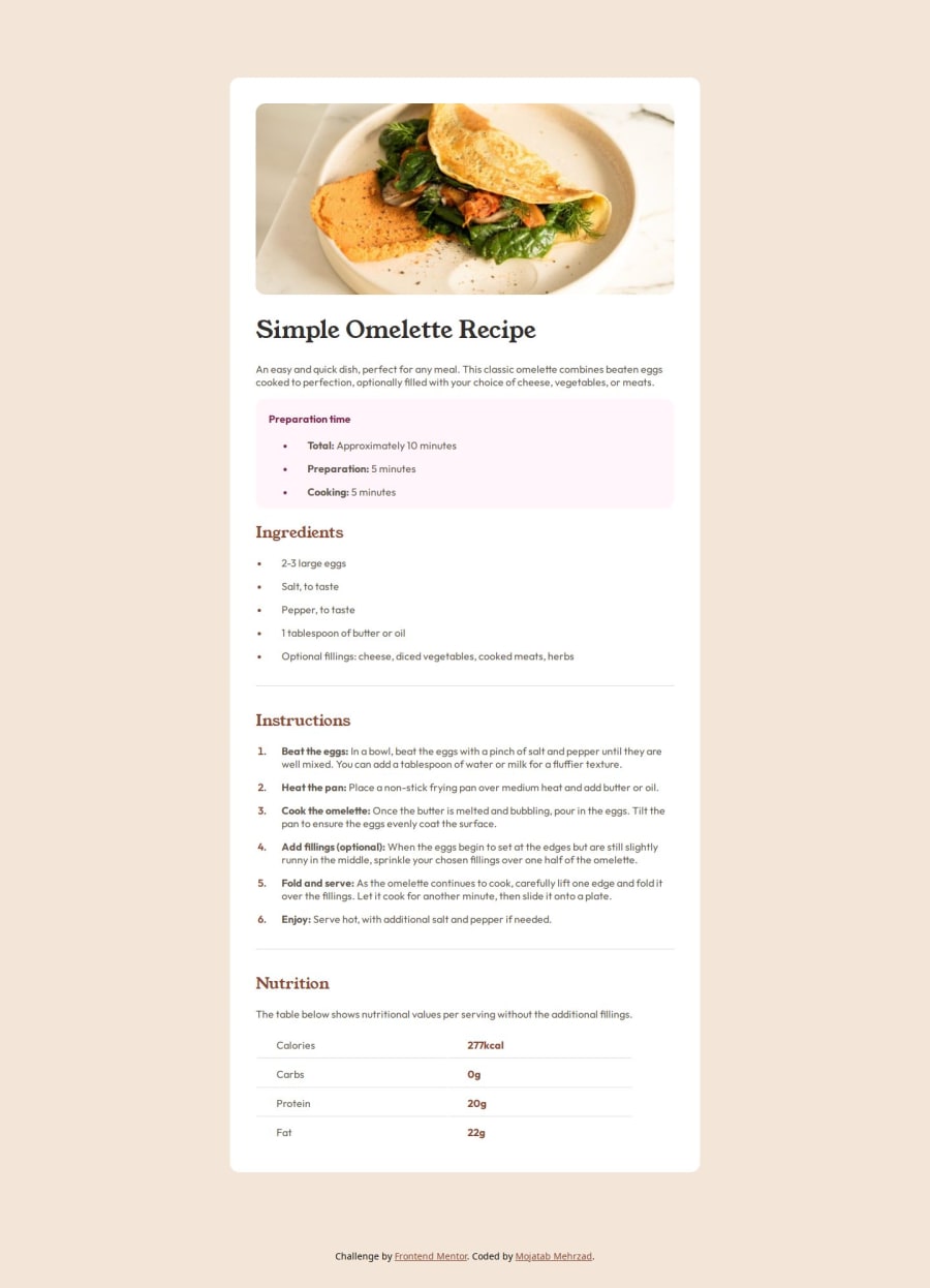
<div class="banner"><img src="./assets/images/image-omelette.jpeg" alt="omelette"></div> <div class="top-section"> <div class="title"><h1 class="title-text">Simple Omelette Recipe</h1></div> <div class="description"><p>An easy and quick dish, perfect for any meal. This classic omelette combines beaten eggs cooked to perfection, optionally filled with your choice of cheese, vegetables, or meats.</p> </div> </div>- Your heading elements
<h1><h4>Missing h2 h3, Heading elements should be in sequentially-descending order (e.g.,<h1>,<h2>,<h3>) to create a clear content structure, improving accessibility and SEO. Skipping levels or using them out of order can confuse screen readers, affect search engine rankings, and make your content harder to understand.
<h1 class="title-text">Simple Omelette Recipe</h1> <h4 class="section-one-title">Preparation time</h4>-
Using
font-display: swapin your@font-facerule improves performance by showing fallback text until the custom font loads, preventing a blank screen (flash of invisible text). The downside is a brief flash when the font switches, but it’s usually better than waiting for text to appear. -
Using a full modern CSS reset is beneficial because it removes default browser styling, creating a consistent starting point for your design across all browsers. It helps avoid unexpected layout issues and makes your styles more predictable, ensuring a uniform appearance on different devices and platforms, check out this site for a Full modern reset
-
I think you can benefit from using a naming convention like BEM (Block, Element, Modifier) is beneficial because it makes your CSS more organized, readable, and easier to maintain. BEM helps you clearly understand the purpose of each class, avoid naming conflicts, and create reusable components, leading to a more scalable codebase. For more details BEM,
-
Using
remoremunits in@mediaqueries is better thanpxbecause they are relative units that adapt to user settings, like their preferred font size. This makes your design more responsive and accessible, ensuring it looks good on different devices and respects user preferences.
@media only screen and (max-width: 376px)I hope you’re finding this guidance useful! Keep refining your skills and tackling new challenges with confidence. You’re making great progress—stay motivated and keep coding with enthusiasm! 💻
Marked as helpful0 - Overusing


Please log in to post a comment
Log in with GitHub
Join our Discord community
Join thousands of Frontend Mentor community members taking the challenges, sharing resources, helping each other, and chatting about all things front-end!
Join our Discord