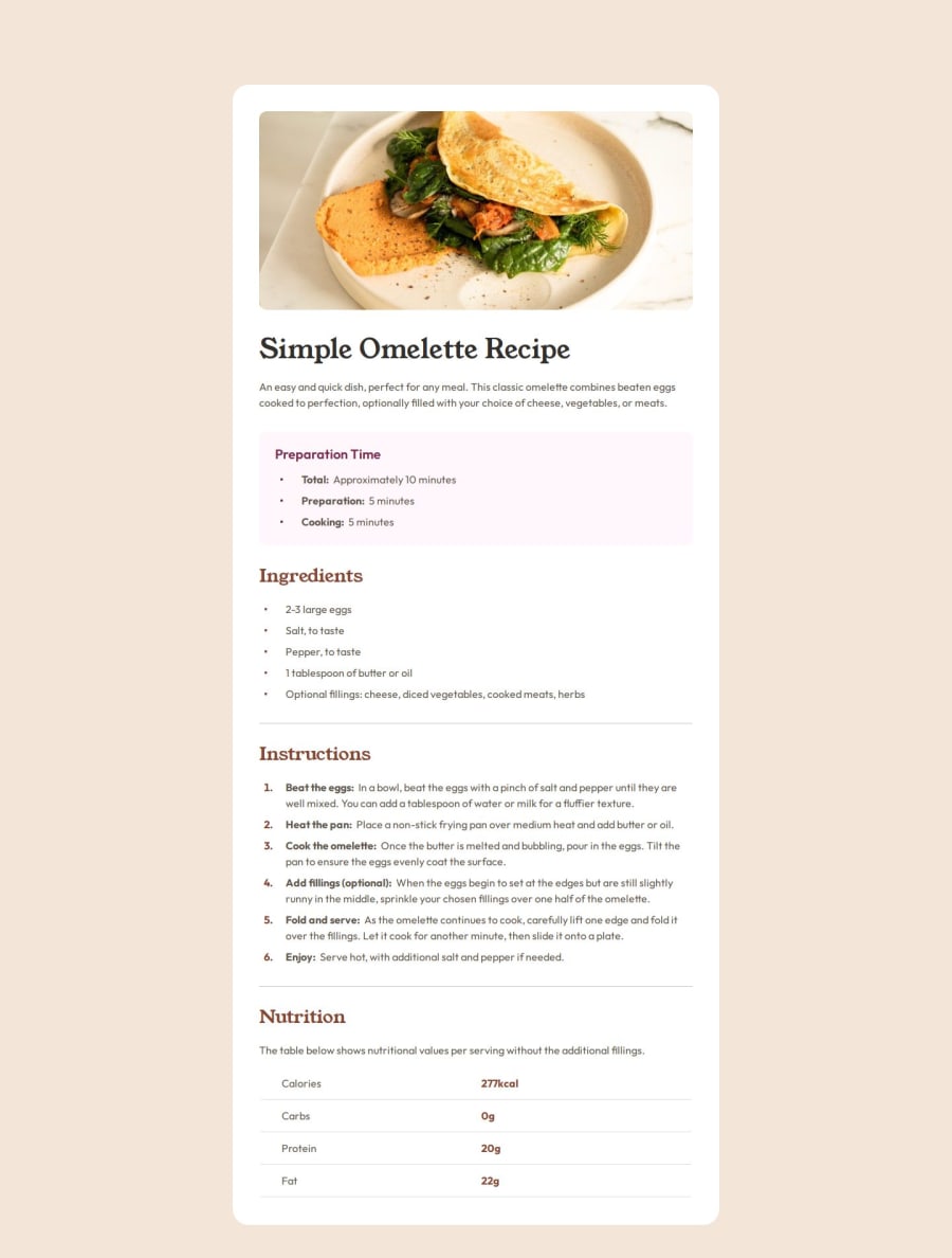
Design comparison
Solution retrospective
To be honest, the only reason I did this project in the first place was because I was bored. It's a very straightforward project with little to no challenge
What challenges did you encounter, and how did you overcome them?The only small challenge that I encountered is implementing the right dot markers for the lists in the webpage. Using list-style-image: url('./myMarker.svg') had one small issue, the dot image could not be centered, and using the ::marker pseudo element had very limited css properties that could be used.
I ended up using the ::before pseudo element to create a marker that can be centered
I don't believe I needed any help with this project
Community feedback
Please log in to post a comment
Log in with GitHubJoin our Discord community
Join thousands of Frontend Mentor community members taking the challenges, sharing resources, helping each other, and chatting about all things front-end!
Join our Discord
