Not Found
Not Found
Not Found
Not Found
Not Found
Not Found
Not Found
Not Found
Not Found
Not Found
Not Found
Not Found
Not Found
Not Found
Not Found
Not Found
Not Found
Not Found
Not Found
Not Found

Submitted

Recipe page

P

@steveostler

Desktop design screenshot for the Recipe page coding challenge

This is a solution for...

  • HTML
  • CSS
1newbie
View challenge

Design comparison


SolutionDesign

Solution retrospective


What are you most proud of, and what would you do differently next time?

|I attempted this myself without searching for any help.

What challenges did you encounter, and how did you overcome them?

I struggled with the Nutritional information at the bottom of the card and could not get it to align correctly and i am searching for a solution

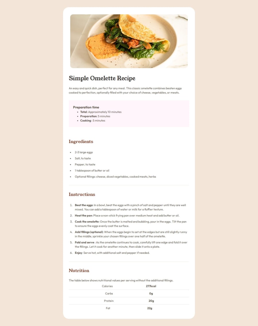
What specific areas of your project would you like help with?

I had an issue with the styling of the border radius on the image a the top of the page. When I added padding the border radius disappeared. I managed to fix it with the follwing code but I do not understand how this works,

 .recipe .recipe-img{
        padding: 40px 40px 0 40px;
        border-radius: 1rem;
        overflow: hidden;
    }

    .recipe .recipe-img img{
    border-radius: 1rem;
    }

Community feedback

@xaintobas

Posted

Hi @steveostler,

Nice work on your design!

I reviewed the original code and your implementation for aligning the nutritional information. I noticed that you struggled with getting the information to align correctly. Your current approach using an unordered list with spans is functional, but aligning elements within a list can sometimes be challenging. I have a few suggestions that might help:

I recommend using a table for this type of information. Tables are inherently better for displaying data that needs to be aligned in rows and columns.

<table>
  <tr class="td__row">
    <td class="td__name">Calories</td>
    <td class="td__value">277kcal</td>
  </tr>
  <tr class="td__row">
    <td class="td__name">Carbs</td>
    <td class="td__value">0g</td>
  </tr>
  <tr class="td__row">
    <td class="td__name">Protein</td>
    <td class="td__value">20g</td>
  </tr>
  <tr class="td__row">
    <td class="td__name">Fat</td>
    <td class="td__value">22g</td>
  </tr>
</table>
table {
  width: 100%;
}
td {
  padding: 1rem 1rem 1rem 2.5rem;
  border-bottom: 1px solid grey; /* You can change the color */
}
.td__value {
  font-weight: 700;
  color: grey; /* You can change the color */
}

Benefits of Using a Table: -Tables provide a straightforward way to align data in rows and columns. -Tables can be more accessible to screen readers and other assistive technologies when used correctly. -It's easier to style rows and columns using CSS with tables.

I hope you find my feedback valuable and helpful.

If yes, I would appreciate it greatly if you could mark my comment as helpful!

Happy coding 😊

Marked as helpful

0

P

@steveostler

Posted

Thanks for your suggestion @xaintobas I originally set out to use table tags but changed my mind. I can see how table would be better

0

Please log in to post a comment

Log in with GitHub
Discord logo

Join our Discord community

Join thousands of Frontend Mentor community members taking the challenges, sharing resources, helping each other, and chatting about all things front-end!

Join our Discord