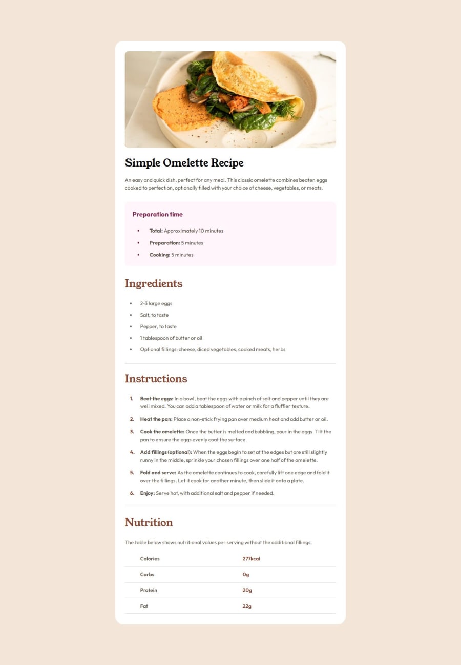
Design comparison
Solution retrospective
I'm most proud of on implementing the counter, counter-reset, counter-increment properties and how I structure the HTML base on the website I research.
If I would do this project again. I would do the margin-top and margin-bottom spacing of the card differently.
What challenges did you encounter, and how did you overcome them?The challenge that I have encountered while doing this project is styling the unordered list dot and ordered list dot which is the preparation section, ingredients section and instructions section.
I overcome this challenge by researching on different recipe websites. Chrome developer tools came in handy to overcome this challenge what I did is inspect the HTML of different recipe websites. This approach give me idea on how I will structure or style my elements.
What specific areas of your project would you like help with?I'm not unsure if setting a margin-block-start and margin-block-end on the card for spacing it is a good approach.
...article content recipe
@media only screen and (min-width: 64rem) {
  main {
    margin-block: 8rem;
  }
Community feedback
- @IvanBerkutPosted 11 months ago
Hello Ralph. I like your implementation. Keep it up =)
1
Please log in to post a comment
Log in with GitHubJoin our Discord community
Join thousands of Frontend Mentor community members taking the challenges, sharing resources, helping each other, and chatting about all things front-end!
Join our Discord
