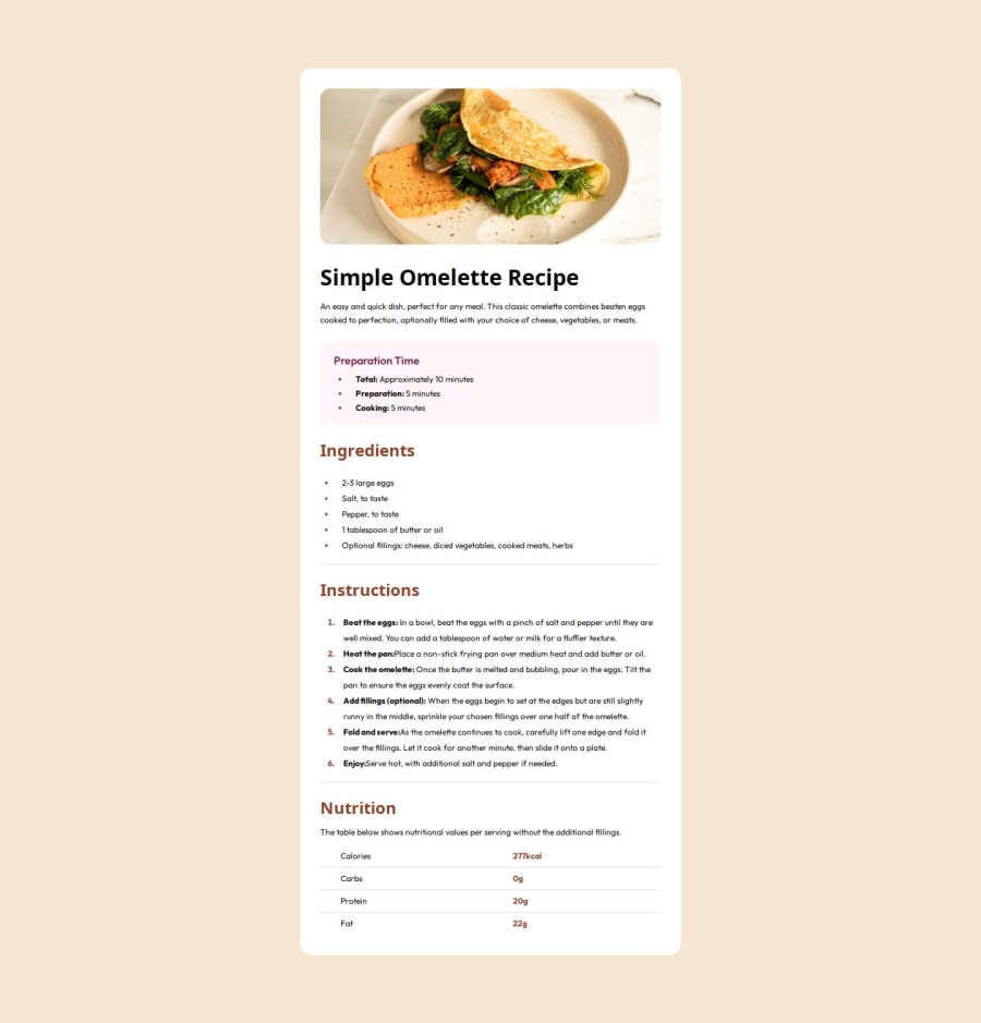


Design comparison
SolutionDesign

Solution retrospective
What are you most proud of, and what would you do differently next time?
Hello! I am really proud of how my project turned out. I love the way the colors and layout come together.
What specific areas of your project would you like help with?I'm still new to html and css, so I'll appreciate any advice on how to improve my skills. I want to learn more about responsive design, I’m especially interested in understanding how to use media queries, flexbox, and grid to make layouts adjust to different screen sizes.
Community feedback
- P@OdiestaPosted 2 months ago
Hi Lena Milena, great for completing the challenge. I want to give feedback which may improve your code.
- Use semantic main tag in recipe content and section tag for different section like ingredients, instructions
- Use css reset. it will make style across different browser same
- Use max-width instead of width, so it will resize responsively in small screen and stay with max-width in big screen
- Use css variable for color to make it easy to manage and change.
- You should set meta tag inside head into viewport to allow control over viewport. In vscode you could type
!and hit tab so it will add necessary code before starting
<meta charset="UTF-8" /> <meta name="viewport" content="width=device-width, initial-scale=1.0" />- Use media queries to set different style in different breakpoint. for example
@media (max-width: 600px) {
  .recipe-content {
    padding: 0;
    margin-top: 0;
  }
}
as for learning responsive design check this course from web.dev Learn Responsive Design
Marked as helpful0

Please log in to post a comment
Log in with GitHub
Join our Discord community
Join thousands of Frontend Mentor community members taking the challenges, sharing resources, helping each other, and chatting about all things front-end!
Join our Discord