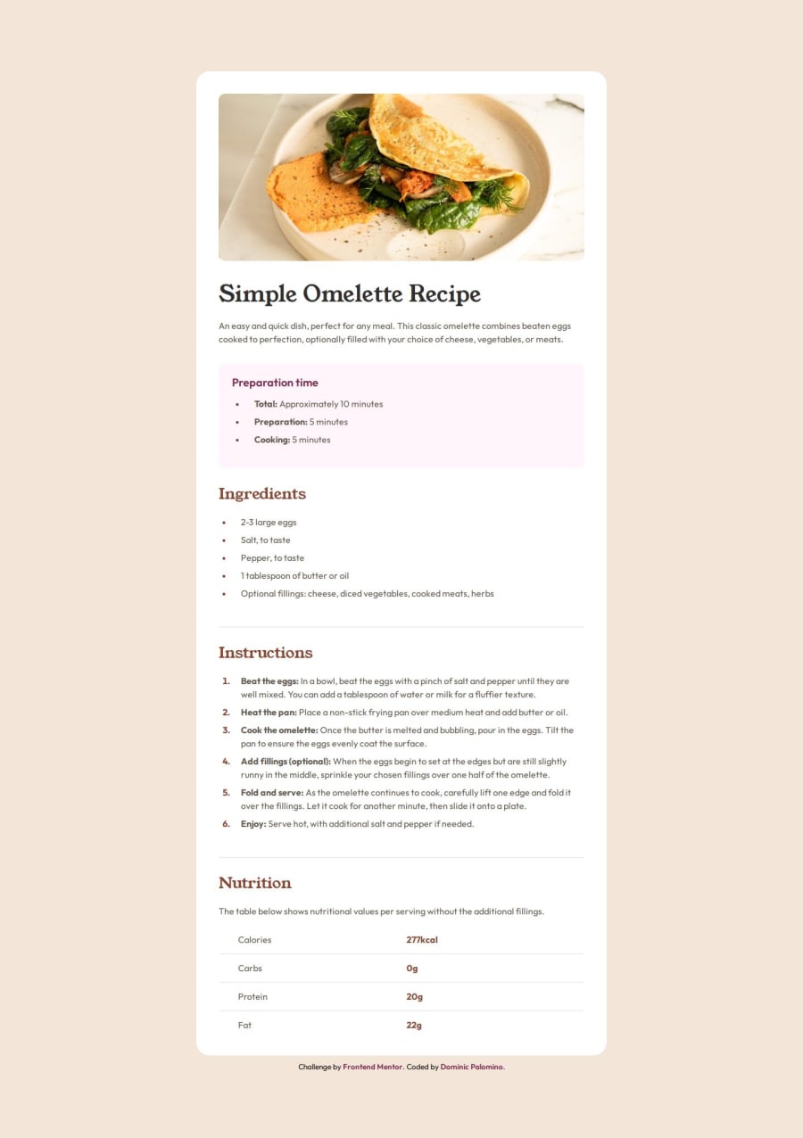
Design comparison
Solution retrospective
Customizing the ordered list numbers, but I was able to find a simple solution using css and the ::before pseudo element.
What specific areas of your project would you like help with?I would appreciate any feedback on ways that I can make my html more semantic if at all possible. Thank you!
Community feedback
- @geomydasPosted 10 days ago
Hi @Dpal88, your solution and code looks good but it has some few issues. Don't worry though as these issues are very easy to fix and is a common mistake when learning. "Mistakes are a part of learning".
My Tips and Feedback
- Consider self-hosting your fonts instead of using Google Fonts. Google Fonts violates privacy laws such as GDPR which can be a problem on larger sites due to lawsuits and it it also slower. I use this handy resource for helping me self host my fonts.
- Use the
::marker
pseudo-class to change the list styling instead of using ::before. - Use proper semantic HTML. Replace the
.container
div with a<main>
tag instead. The<main>
tag signifies the main content of a site and each site should have atleast 1 main tag. There is no need for the<header>
or<section>
tags as there are already headings. Replace all of the<h3>
tags with an<h2>
tag, self explanatory since the headings are the same. Also, the.attribution
div should be a<footer>
tag instead. Use the<strong>
tag instead of a span for the bold text. - Use a CSS reset. What a CSS reset does is that it makes your styles look more consistent across devices and browsers since it removes all of the browser default styling. I recommend Andy Bell's or Josh Comeau's CSS reset for this. For this type of project where there are alot of text, use Andy Bell's CSS reset instead. You should also use a CSS reset for all of your projects. You don't have to do anything special since you only need to copy and paste the CSS reset inside your code.
- No need for
counter-increment
for this.
That's pretty much all and refactor your code after this and I will continue with feedback.
Marked as helpful0@Dpal88Posted 10 days agoHi @geomydas ,
Thank you for all the feedback, I'm gonna work on getting these changes implemented into my code.
However, I'm a little lost on when I should be using the <header> and <section> tags. Are you able to elaborate a little more on why my usage of those tags are incorrect?
0 - @saifuldtPosted 10 days ago
hey @Dpal88
your design is nice But Change some issue *font-size *background-color
1@Dpal88Posted 10 days agoHi @saifuldt ,
I completely missed that I had the wrong background color, thank you for the heads up!
0
Please log in to post a comment
Log in with GitHubJoin our Discord community
Join thousands of Frontend Mentor community members taking the challenges, sharing resources, helping each other, and chatting about all things front-end!
Join our Discord