Design comparison
Please log in to post a comment
Log in with GitHubCommunity feedback
- @ItsZubek
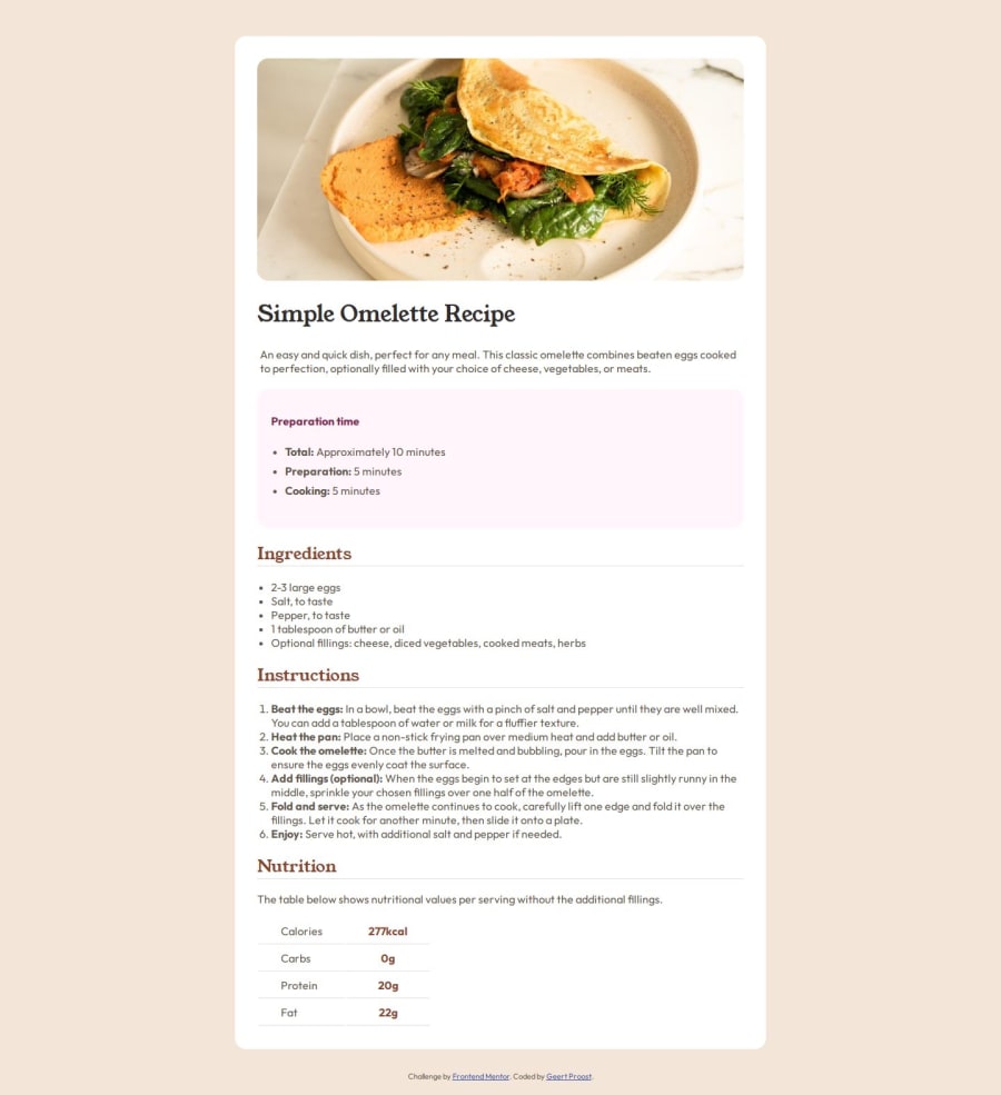
All necessary HTML is there. However I think you placed the
tdandthwrong way around.this table header which should be the first column of the table (calories, carbs, etc. ) andtdis table data which are the values. I'd improve on the CSS aspect of the project as it seems you gave up on it halfway through. I can clearly see you know how to style the elements, but you didn't choose to do so in the later part of the design. As for the table an easy fix to make it look more like the design is to use thewidthproperty and set it to100%and then select thethandtdand make them 50% and it should sort out the issue. Overall a good attempt and solid work, but I would try to finish the challenge even if you 100% know how exactly to do it - practice makes perfect.
Join our Discord community
Join thousands of Frontend Mentor community members taking the challenges, sharing resources, helping each other, and chatting about all things front-end!
Join our Discord
