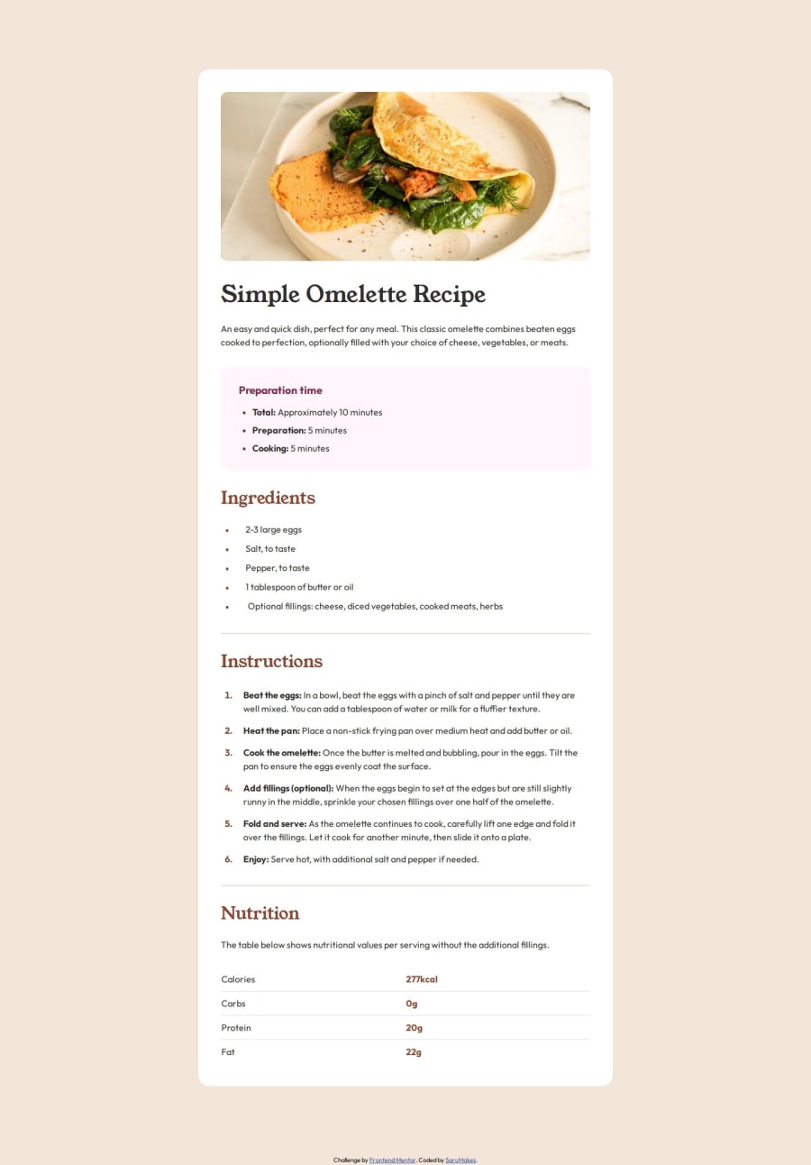
Design comparison
Solution retrospective
I'm proud of my solution to style the various list-items and their bullets/numbers without having to resort to very exotic CSS. I'm also proud of my growing understanding of, and ability to troubleshoot my code.
I took great care to try to emulate the design, based solely on the provided .jpg images, by overlaying boxes on top of the design in Figma, to be able to measure distances between elements. As of writing this, I have yet to see how my site compares to the original, when seen side-by-side on Frontend Mentor, so that will be interesting to see. I may have to make some edits, based on how it turns out.
As for what I'd do differently: I wish I'd done the mobile version first, or at least planned for it a bit better from the beginning. I ended up having to do a good bit of changes, to fix the border padding/margins. Which, as I'm writing this, I'm realising might've been easier to fix by simply changing my overall setup in HTML.
What challenges did you encounter, and how did you overcome them?I really struggled with the layout for the and once the text spread across more than one line. Initially I'd used to make the beginning of the paragraphs bold, and then have the rest set as paragraphs. I then learned that it's generally not good form to even use to style your text as being bold. I then considered if I should use a custom styled or simply use. I ended up choosing the former, as I felt that the bold text was more of a stylistic element, rather than something that conveyed extra meaning.
This switched some indentation issues, I was struggling with.
The next issue was then figuring out how to vertically align the bullet points to the content when the content spans multiple lines. In the end I removed the bullet points from the list styling, and then added them back in as a custom symbol, that I could then style independently. I then made the parent `` a flexbox and set it to align-items: center;.
Any tips on how I can improve my code would be greatly appreciated!
I'm still very much trying to focus on Semantic HTML, so if anyone has some comments, critique or advice, then that would be great! 🙂
Community feedback
- @SaruMakesPosted 9 months ago
Hmmmm, I can see that I created some spacing issues after rewriting parts of the code for mobile. I'll have to fix those tomorrow.
EDIT: I fixed some of the spacing parts, but now I see that there are some indentation issues. I may come back to revisit this again in the future, and fix these parts as well, but for now I'll move on to the next project.
0
Please log in to post a comment
Log in with GitHubJoin our Discord community
Join thousands of Frontend Mentor community members taking the challenges, sharing resources, helping each other, and chatting about all things front-end!
Join our Discord
