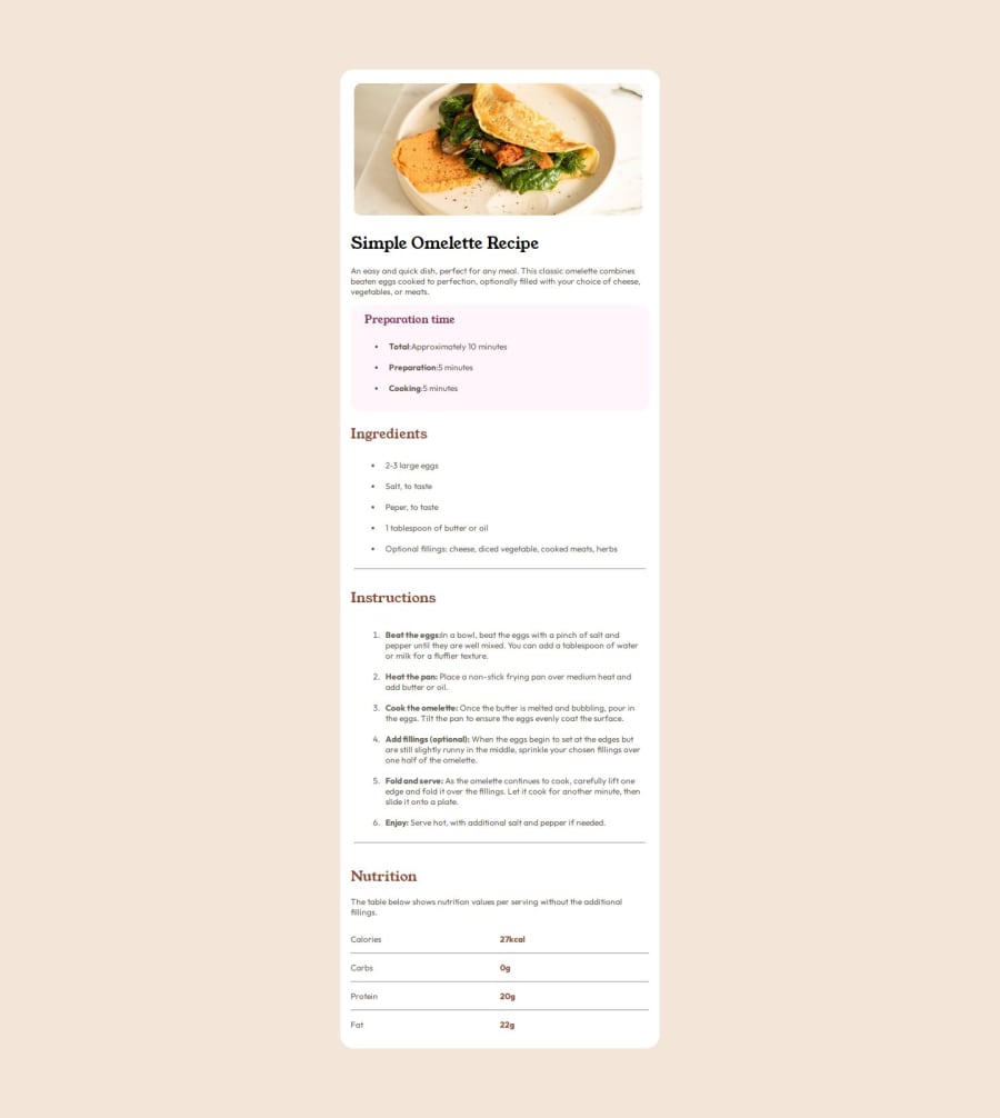
Design comparison
SolutionDesign
Solution retrospective
What are you most proud of, and what would you do differently next time?
It's a great project
What challenges did you encounter, and how did you overcome them?The margins and paddings
What specific areas of your project would you like help with?the margins and paddings
Please log in to post a comment
Log in with GitHubCommunity feedback
- @Timelessgreed
Thank you very much for your feedback
- @john-mirage
Hello, nice work !!
Here some ways you can improve your project:
- Your card has a fixed width, you can make it responsive by adding a relative width of 100% and a max-width of 460px so the card will shrink when the screen width in under 460px
- To help you start a project, you can add a css reset file. It defines some rules to ease your workflow.
- You can add meta tags in your <head> element to display informations and an image for Google and the social medias like facebook and twitter.
- The omelette image can be converted in webp format, webp format compress images more so you get less loading time.
- Your page overflows on the right (on my screen) because your wrapper has a width of 100vw, removing this rule fix the issue.
- For the nutrition section, you can use a <table> element.
- There is a left padding on the lists by default, you can remove them by adding
padding: 0on the <ul> or <ol> elements. - Your project do not contains media queries, you can add some to make your project fully responsive.
Join our Discord community
Join thousands of Frontend Mentor community members taking the challenges, sharing resources, helping each other, and chatting about all things front-end!
Join our Discord
