Design comparison
Solution retrospective
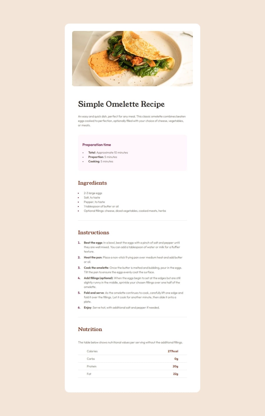
I feel am getting better with the way am setting my css file!
What challenges did you encounter, and how did you overcome them?The Nutrition section was a bit tricky
Community feedback
- @BenasUrbaPosted 6 months ago
Looks good, but you need to work on the margins and padding. Seems that there are sometimes too much padding in some elements, whereas some elements lack padding. For example, the ingredients list of items could use some vertical padding maybe 10px? Also your actual area after the picture seems to have a lot of padding. Anyways, good work, these are just minor changes that you will learn in no time. Well Done!
0
Please log in to post a comment
Log in with GitHubJoin our Discord community
Join thousands of Frontend Mentor community members taking the challenges, sharing resources, helping each other, and chatting about all things front-end!
Join our Discord
