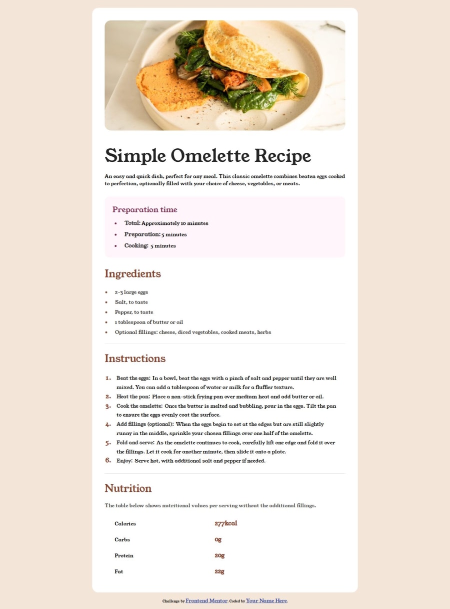
Design comparison
Solution retrospective
Would please help review this submission and provide feedback.
1). I’m having issues with @media query 2). Having difficulties adding the borders under nutrition section.
Any help or feedback is appreciated.
Community feedback
- @Joel12rPosted 10 months ago
In your CSS, the media query is missing the and keyword before specifying the condition. Here's the corrected media query:
css Copy code @media screen and (max-width: 375px) { /* CSS rules for screens with a maximum width of 375px */ } or you can simple not add the key word screen , and it applies to all devices.
and also you dont need to add quotes font-family: 'Young serif', sans-serif; you can simply write it like this font-family: Young serif, sans-serif;
And for the table, I used a bootstrap class and just used the css to remove the border for the last row
0@harolddatusPosted 10 months ago@Joel12r, thank you for your feedback. I added the code and does not seem to fix the responsive issue.
0@Joel12rPosted 10 months ago@harolddatus I tried these changes and it was responding to any screen width below 375px
@media (max-width:375px) { body { background-color: brown; display: flex; flex-direction: column; align-items: center; justify-content: center; min-height: 100vh; } . its still the same you wrote, I just changed the background color and added px to 375
Marked as helpful0
Please log in to post a comment
Log in with GitHubJoin our Discord community
Join thousands of Frontend Mentor community members taking the challenges, sharing resources, helping each other, and chatting about all things front-end!
Join our Discord