Design comparison
SolutionDesign
Solution retrospective
What are you most proud of, and what would you do differently next time?
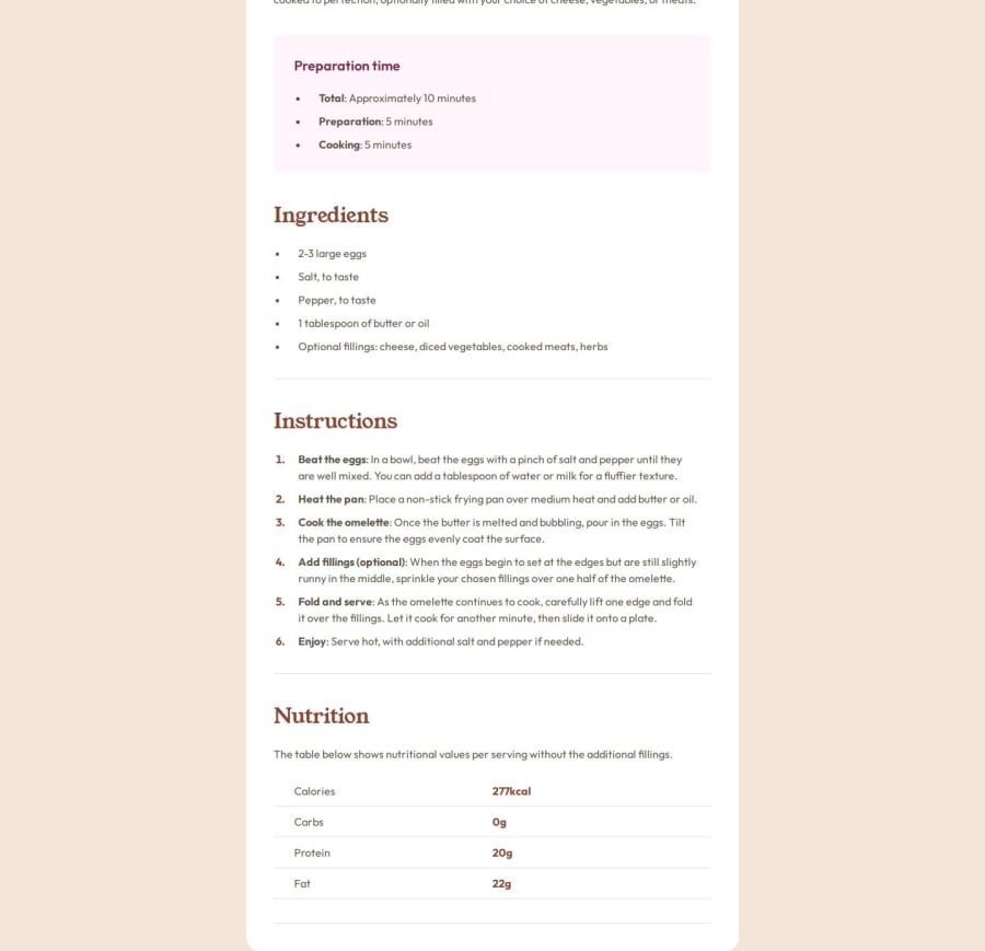
Styling the main "card", each section and the table.
What challenges did you encounter, and how did you overcome them?Add space at the left of first table cells without pushing the second column. Found the solution at stackoverflow and W3S.
What specific areas of your project would you like help with?Maybe with semantic tags.
Community feedback
- @Code-Me-WellPosted 4 months ago
Your solution stands out, man! Great work there. However,
- your screenshot is cropped, which could potentially turn someone off at first glance unless they visit your page and see how amazing it really is. For the screenshot, you can use Edge or Chrome's DevTools to take a full-page screenshot without scrolling or cropping.
Your code looks well-structured and semantic, but
- I’m curious why you’ve included so many Node packages. Also, it seems like your file structure isn’t organized.
- Try adding a .gitignore file and structuring your files more systematically.
Marked as helpful1
Please log in to post a comment
Log in with GitHubJoin our Discord community
Join thousands of Frontend Mentor community members taking the challenges, sharing resources, helping each other, and chatting about all things front-end!
Join our Discord
