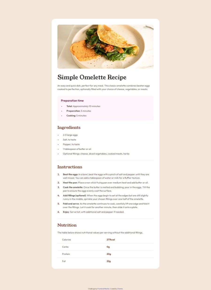
Design comparison
Solution retrospective
I tried to use semantic html elements as much as possible. I want to create a clear workflow that will make me more efficient.
What challenges did you encounter, and how did you overcome them?I had trouble styling the list items. I initially set the list-style to inside causing the following lines to be bellow the bullets and not aligned. My final solution was setting it to outside and using margin and padding to achieve the effect I need. I initially thought of using flexbox for the nutrition section but I decided to try using the table element. I'm not that proficient in using advanced selectors so I used classes for the first and last items to set the styling. I was trying to achieve the exact pixels in the Figma file.
What specific areas of your project would you like help with?-
If list-style is set to inside, is there another way for the texts to be aligned? I tried the text-indent but it's not really achieving the look I want.
-
How to select the first and last items in a table? Like in this challenge, I need to remove the bottom padding and border and tried last-child but it affects multiple cells.
Community feedback
Please log in to post a comment
Log in with GitHubJoin our Discord community
Join thousands of Frontend Mentor community members taking the challenges, sharing resources, helping each other, and chatting about all things front-end!
Join our Discord
