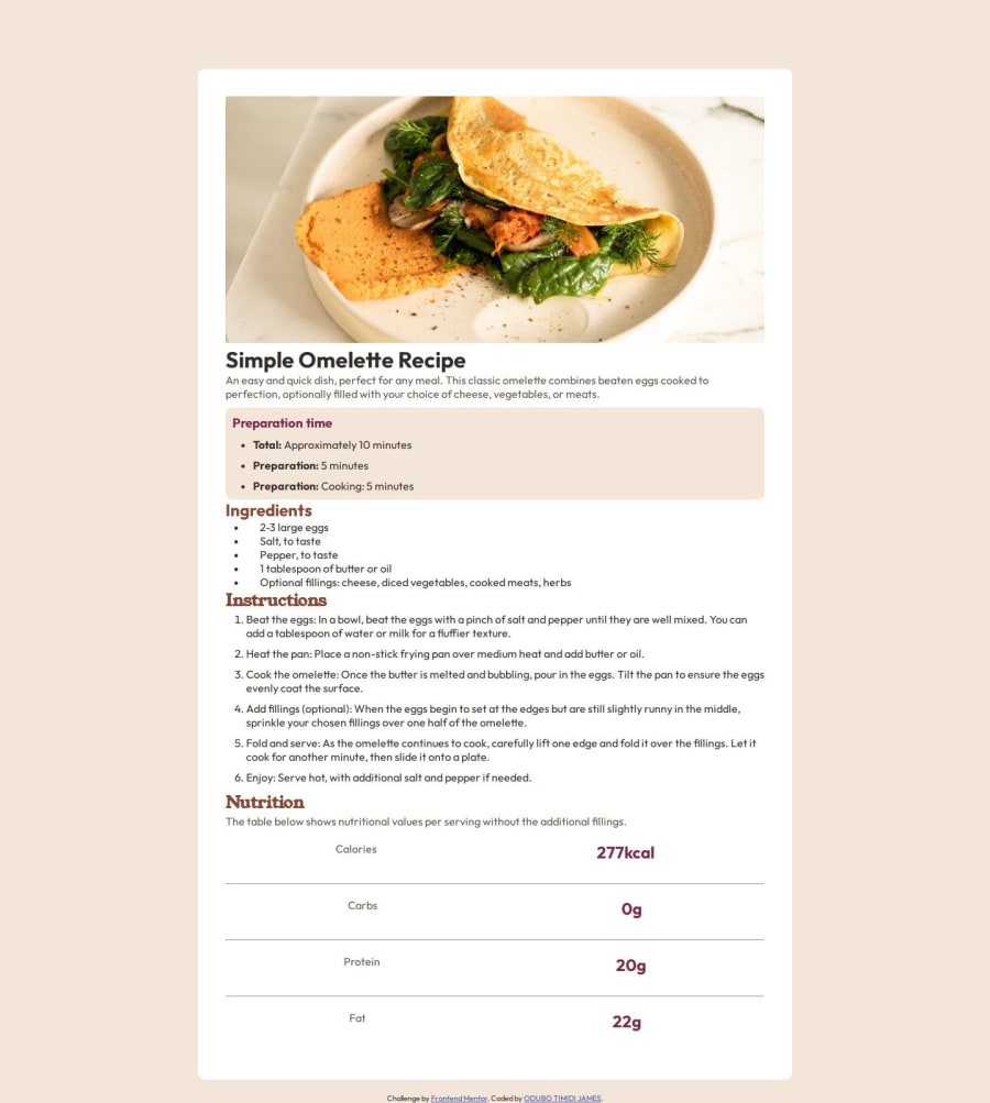
Design comparison
SolutionDesign
Solution retrospective
What are you most proud of, and what would you do differently next time?
I use the flexbox property to design it. What I will love to do differently is to use grid
What challenges did you encounter, and how did you overcome them?The challenge I encountered was applying the background to the second item on the page. I had to adjust the margin and padding
What specific areas of your project would you like help with?I would like to work more on the layout, to make it look better on small screen
Community feedback
Please log in to post a comment
Log in with GitHubJoin our Discord community
Join thousands of Frontend Mentor community members taking the challenges, sharing resources, helping each other, and chatting about all things front-end!
Join our Discord
