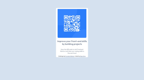
Design comparison
Solution retrospective
I am very proud due to the fact that I focused on not looking at my notes and just trying to code this as if I was working on a project for a client on a deadline. I tried to use the documentation for many of the aspects that I was unsure of and played around with styling for a little before I figured out what I needed to do to get the display that I was looking for.
What challenges did you encounter, and how did you overcome them?This biggest challenge I had was styling the @media query although I know it is not perfect, I am happy with the results. I used the documentation on media query to do the best that I can, and I am very happy with how it turned out in the end, especially in the sense of scalability.
What specific areas of your project would you like help with?The media query if someone wants to explain what I did wrong or what I can do better next time, I am all ears.
Community feedback
- @danielmrz-devPosted 7 months ago
Hello, @MsftKing!
Your project is looking fantastic!
I'd like to suggest a way to make it even better:
- Using
margin
isn't always the most effective method for centering an element.
Here's a highly efficient approach to position an element at the center of the page both vertically and horizontally:
š Apply this CSS to the body (avoid using
position
ormargins
in order to work correctly):body { min-height: 100vh; display: flex; justify-content: center; align-items: center; }
I hope you find this helpful!
Keep up the excellent work!
Marked as helpful1@MsftKingPosted 7 months agoThank you so much, I was struggling trying to get the image to center the way I wanted. I will add this tip to my notes for future use! @danielmrz-dev
1 - Using
- @AnwarMestycerPosted 7 months ago
Hi Ryan, You did well, and your work is great.
here's how can help you make it better,
- In your HTML file, as best practice, all the code should be inside the
<body>
like this:
<!DOCTYPE html> <html> <head> </head> <body> your code should be written here </body> </html>
then add a body selector in your CSS file and apply the
background-color: #D5E1EF;
inside instead of html, which is useless in our context.- Also, to center your card
display:flex; justify-content:center; align-items: center
in the body selector. -Change the color of the h1 to black to match the design
This is just the beginning of your awesome journey as a front-end developer Keep up the good work.
I hope this was helpful, and if you need any help, don't hesitate to contact me here.
0 - In your HTML file, as best practice, all the code should be inside the
Please log in to post a comment
Log in with GitHubJoin our Discord community
Join thousands of Frontend Mentor community members taking the challenges, sharing resources, helping each other, and chatting about all things front-end!
Join our Discord