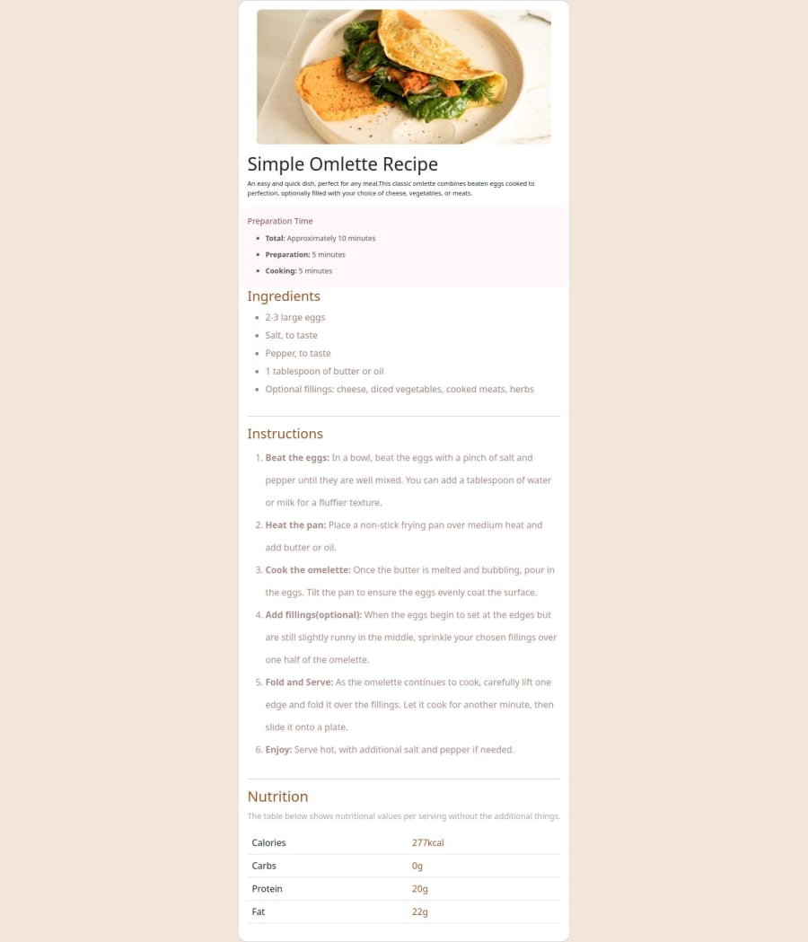
Design comparison
Solution retrospective
I am proud of that I understood media query format in CSS and got help to make this project Responsive friendly in all devices and got help from some members from Frontend mentor to get knowledge of making webpages responsive friendly in all devices which I achieved in this project, next, time I would look onto improve more on developing responsive pages and apps.
What challenges did you encounter, and how did you overcome them?The only challenge I have is proper alignment in mobile device, so, I am expecting help from some of the members, on this proper alignment of webpage in mobile device.
What specific areas of your project would you like help with?I would like help with to make more responsiveness of this webpage in mobile devices and tablets, expecting help from members and Frontend mentor community.
Community feedback
- @HiraeightPosted 6 months ago
Hi there fellow coder! You did great with your solution, and I would like to give some of my suggestions on how to make your coding to the next level!
- You can apply some font weight on your headers to give it some highlight for the readers (eg. Ingredients, Instructions, Nutrition)
- You can apply padding on your 'card card-recipe' to give some spacing and to make your content look like it is centered.
- I also noticed a type on your header below the image. I think it is missing an 'e'
Overall, you did a great job and keep it up! Continue on learning and inspiring others. Cheers!
0
Please log in to post a comment
Log in with GitHubJoin our Discord community
Join thousands of Frontend Mentor community members taking the challenges, sharing resources, helping each other, and chatting about all things front-end!
Join our Discord
