Solution retrospective
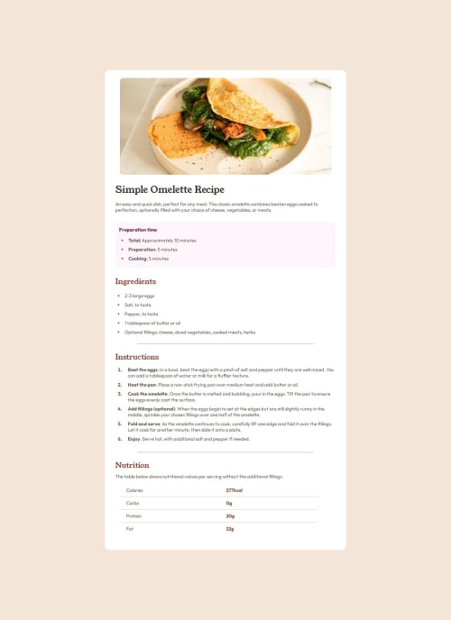
I learned three to four new things with this project: styling and using the hr, table, and marker tags for my list. I would probably try and use an alternative to hr when it comes to the line breaks in the project, just to see if there's a way that's simpler and neater. I was pretty proud for buckling down and coding most of this in one sitting, except when I got to the table portion.
What challenges did you encounter, and how did you overcome them?I didn't know how to make the numeral notation in the list section a different color, but I managed to figure it out using markers. I also was confused on how to set up the nutrition information at the end, but I eventually chose to use a table.
What specific areas of your project would you like help with?I did choose to use to emulate the line breaks in the design, but I'm curious to see if there's a better or neater way to accomplish that with another kind of CSS. I'd also like to know if I used the table html correctly for the nutrition information section.
Please log in to post a comment
Log in with GitHubCommunity feedback
No feedback yet. Be the first to give feedback on Ye-Won Seo's solution.
Join our Discord community
Join thousands of Frontend Mentor community members taking the challenges, sharing resources, helping each other, and chatting about all things front-end!
Join our Discord