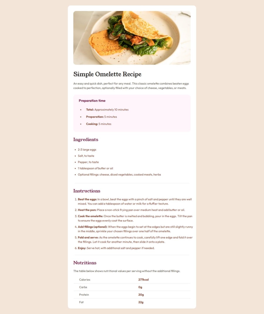
Design comparison
Community feedback
- @laurafilhaPosted 9 months ago
Code is very well organized and easy to understand, which makes maintenance and collaboration much simpler. The solutions you used worked very well, especially regarding spacing. I really liked the choices you made to maintain visual harmony and clarity.
I noticed that we made some similar decisions in our challenge, which reinforces the effectiveness of the approaches we chose. Overall, the result was a success and the final product turned out excellent.
Congratulations on the great work!
0 - @ryyHardyPosted 9 months ago
This is extremely close to the design images so I had trouble poking holes in it. The CSS is very well-organized, too.
The only significant thing I'd like to point out is that there are a lot of hard-coded pixel sizes in the CSS code, so the design doesn't scale to smaller screens. Responsive design is hard, though, so I understand. Here is a Kevin Powell video about responsive design I really like, if you want to learn more: https://www.youtube.com/watch?v=x4u1yp3Msao. Really great person for learning CSS overall.
0
Please log in to post a comment
Log in with GitHubJoin our Discord community
Join thousands of Frontend Mentor community members taking the challenges, sharing resources, helping each other, and chatting about all things front-end!
Join our Discord

