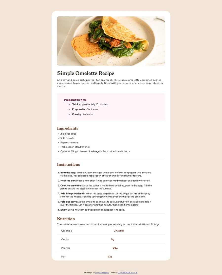
Design comparison
Solution retrospective
i am proud of making my second project.
Next time i will not do so much nesting and make my code cleaner
What challenges did you encounter, and how did you overcome them?trying to make it responsive
i overcame it by learning how to make it responsive
What specific areas of your project would you like help with?not nesting so much and also fix the nutritional part
Community feedback
- @d0t666Posted 6 months ago
You should learn more about how to name classes. In the Nutrition section, the numbers at the end should not be aligned with each other.
1@YoYoIsFunPosted 6 months agoI don’t know what you mean. You said they shouldn’t be aligned@d0t666
0@d0t666Posted 6 months ago@YoYoIsFun in your nutrion table call "SPACE". value of nutrion doesnt straight. right-column. 277kcal - 0g - 20g -22g should straight
0 - @grace-snowPosted 6 months ago
Feedback as promised. These are all for this challeng but also lay foundational practices for other projects.
- All content should be contained within landmarks. Everything in this design belongs inside a
mainlandmark, and the attribution should go inside afooter. - Get into the habit ASAP of always including a full modern CSS reset at the start of the styles in every project. Look up Andy Bell's or Josh Comeau's and read about why those properties are good to have at the start of the styles.
- Every
imgelement must have an alt attribute. This image is important content, so that alt must contain a meaningful description of the image. There are some great posts about alt text on the resources channel of the discord server. - Remove all the
brelements in this. It's very rare you'll ever need or want to use a break in HTML. Margin (or the gap property in flex/grid layouts) is how you create space between elements. - Once you've done that you can remove these weird negative percentage margins.
- Font size shouldn't ever be in
px, but it also shouldn't ever be inemunits! Make sure you understand what these units are for. Em is a unit that compounds so can lead to a total mess if over-used, especially on font size. Em is for other properties on the rare occasions where you want a property to specifically scale with the element's font size. - In the head of the HTML you don't need to repeat the google fonts preconnect links. Only have them once. You should be importing the specific families and weights you need for the project. You can do this all in one font link too instead of a separate one for each family.
- It is invalid HTML to have list items on their own. Look up the unordered and ordered list elements on MDN. Meaningful HTML structure is extremely important, I really can't stress it enough. Search engines, browsers and all assistive technology relies heavily on the HTML structure being well formed and meaningful.
- There are extra empty paragraphs in your code that shouldn't be there. That's caused by your HTML not being indented consistently, which makes it extremely difficult to read and to spot bugs. Add the prettier extension into VS code (or other editor) and the HTML can be auto-formatted for you. Make sure every opening tag has a corresponding closing tag (unless a self-closing element like img).
- Do not use position relative and directional properties unnecessarily. There is no reason for any complex layouts in this challenge, it's almost all default html.
- Data tables must be coded as a HTML table. Look up these elements and apply them. You will need to use header cells and the
scopeattribute on the header cells in the design andtd(data cells) for the other cells.
This is probably enough for now. Good luck.
0 - All content should be contained within landmarks. Everything in this design belongs inside a
Please log in to post a comment
Log in with GitHubJoin our Discord community
Join thousands of Frontend Mentor community members taking the challenges, sharing resources, helping each other, and chatting about all things front-end!
Join our Discord
