


@Stroudy
Posted
Well done on getting this far! You’re clearly putting in the effort, and it shows. Just a few things I noticed that could enhance your solution…
- It is unusual to add
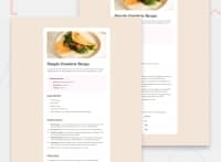
paddingto thebodyto push elements around that is a job formargin. Solution Remove yourmargin: 0;from your body and put it in* { }This targets every element and where you should put a reset like this same withpadding: 0;
* {
margin: 0;
padding: 0; }
-
In your
main { }removemargin: auto;and add thismargin: 8rem auto;What this does8remtop and bottom,autocenters left and right. -
Using
max-width: 100%ormin-width: 100%is more responsive than justwidth: 100%because they allow elements to adjust better to different screen sizes. To learn more, check out this article: responsive-meaning. -
Developers should avoid using pixels (
px) because they are a fixed size and don't scale well on different devices. Instead, useremorem, which are relative units that adjust based on user settings, making your design more flexible, responsive, and accessible. For more information check out this, Why font-size must NEVER be in pixels or this video by Kevin Powell CSS em and rem explained.- Another great resource for px to rem converter. -
Using a naming convention like BEM (Block, Element, Modifier) is beneficial because it makes your CSS more organized, readable, and easier to maintain. BEM helps you clearly understand the purpose of each class, avoid naming conflicts, and create reusable components, leading to a more scalable codebase. For more details BEM,
You’re doing fantastic! I hope these tips help you as you continue your coding journey. Stay curious and keep experimenting—every challenge is an opportunity to learn. Have fun, and keep coding with confidence! 🌟
Marked as helpful
