Not Found
Not Found
Not Found
Not Found
Not Found
Not Found
Not Found
Not Found
Not Found
Not Found
Not Found
Not Found
Not Found
Not Found
Not Found
Not Found
Not Found
Not Found
Not Found
Not Found

Submitted

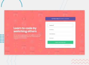
Rechallenge/Review: Intro component with sign-up form

@DrunkenNeoguri

Desktop design screenshot for the Intro component with sign-up form coding challenge

This is a solution for...

  • HTML
  • CSS
  • JS
1newbie
View challenge

Design comparison


SolutionDesign

Solution retrospective


(I translated the sentences into English using 'translate.google.com'. Please understand if there are any strange grammar.)

Hello!

This time, I tried the previous challenge again! When I tried this time, I focused a little more on Javascript.

I wanted to reduce duplication when writing scripts. Nevertheless, the amount of scripts seems to have increased compared to the last time ^^; I'm so happy that the script was written just the way I thought it would!

However, I am wondering if there is a way to reduce it even further here.

Thanks for reading. :D If you have any other suggestions or solutions to the above problems, please feel free to let us know!

Comments always improve my learning!

Community feedback

Vanza Setia 27,795

@vanzasetia

Posted

Hi there! 👋

I recommend focusing on HTML and CSS first, there are some issues that you can fix.

  • Every input element needs a label so I recommend having a sr-only label or making the label a placeholder.
  • The error icon should be a background image instead of an img element. This way, when the input is invalid you can add the error icon on the input element.
  • The type of the button should be submit instead of button.
  • For the alert message, I highly suggest using p instead of div. Always use a meaningful element to wrap text content.
  • input doesn't have a closing tag.
  • The password input should have type="password" and the email input should have type="email". Using the correct type for each input helps the mobile users to get the correct keyboard layout for each type of input.
  • Use the native HTML whenever possible. In this case, it's possible to use main tag instead role="main".
  • Adjust the breakpoint of the media query. Currently on 841px to 877px the text is so narrow.
  • .container__right__form, it can't have an element nested instead an element. I recommend creating a new block element instead. BEM = block__element--modifier not BEE = block__element__element.

I highly suggest writing the styling using the mobile-first approach. It often leads to shorter and better performance code. Also, mobile users won't be required to process all of the desktop styles.

That's it! Hope you find this useful!

1

@DrunkenNeoguri

Posted

@vanzasetia

hello! I read the comments! Thank you very much! Thanks to you, I learned a lot! However, after reading it, I have a question about 'sr-only', so I'm asking!

I've never used Bootstrap, so I've only worked with basic html and css, but when I searched for sr-only, everything related to bootstrap came up.

Can this 'sr-only' work without bootstrap? And I'm still confused as to why I use 'sr-only'. If there is a suitable example, I would like to refer to it!

0
Vanza Setia 27,795

@vanzasetia

Posted

@DrunkenNeoguri You're welcome! 👍

I've just tried to search about sr-only and yeah, the results are dominated by Bootstrap. 😅 Anyway, it has nothing to do with any CSS Framework.

So, sr-only stands for screen reader only. It means that the text or the content can only be read by a screen reader. Basically, the text is visually hidden however it is still accessible by screen readers and search engine bot.

sr-only is commonly used in Frontend Mentor component challenges to have a visually hidden h1 so it removes the accessibility issue because every page should have a h1 and also heading tags should be used in chronological order. So, some solution authors like pretending that they create a component for a full website which they expect the h1 should exist somewhere else on the site. If this is confusing, you don't need to worry about this.

Now to the practical thing. First, I recommend you to open your code editor and create an index.html and a style.css. Make the CSS connect with the HTML and after that copy the below code and paste it into CSS file.

.sr-only {
	border: 0 !important;
	clip: rect(1px, 1px, 1px, 1px) !important;
	-webkit-clip-path: inset(50%) !important;
		clip-path: inset(50%) !important;
	height: 1px !important;
	margin: -1px !important;
	overflow: hidden !important;
	padding: 0 !important;
	position: absolute !important;
	width: 1px !important;
	white-space: nowrap !important;
}

Create a h1 with some text in the HTML and make sure the h1 has the sr-only class. After that, try to preview the site.

You should not see the h1 however if you use a screen reader, the screen reader should be able to read the text of the h1.

Now, let's go back to the label issue. So, since on the design there's no visible label while every input element should have a label element so it's a good situation to use sr-only for the label element. This way, the screen reader user can access the input element without any problem.

Note: Each operating system has its own screen reader. For example, in Windows, there is Narrator, in Android there is Talkback, for Mac there is VoiceOver.

0

Please log in to post a comment

Log in with GitHub
Discord logo

Join our Discord community

Join thousands of Frontend Mentor community members taking the challenges, sharing resources, helping each other, and chatting about all things front-end!

Join our Discord