Design comparison
Solution retrospective
well nothing special
What challenges did you encounter, and how did you overcome them?the challenge was a working with span
What specific areas of your project would you like help with?bottom area with nutrition
Community feedback
- @1lijaPosted 28 days ago
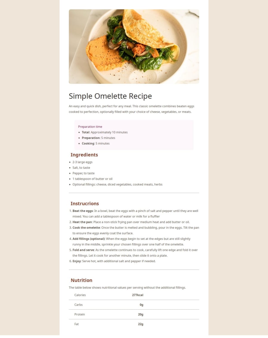
Since there is no code Im just going to make assumptions. Regarding the whole container, you probably made it 100%, you could've made it certain height and made a body tag different height so that the container is not from bottom to top. As for the nutrition on the bottom, you could've made a table element in html with 2 columns and 4 rows, align the text to the left in both columns and it would be even. If that was your problem here, If its something else answer me below I'll try to help. Either way, good job for the rest!
0
Please log in to post a comment
Log in with GitHubJoin our Discord community
Join thousands of Frontend Mentor community members taking the challenges, sharing resources, helping each other, and chatting about all things front-end!
Join our Discord
