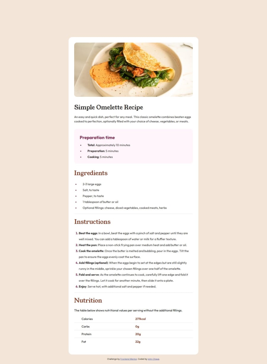
Not Found
Not Found
Not Found
Not Found
Not Found
Not Found
Not Found
Not Found
Not Found
Not Found
Not Found
Not Found
Not Found
Not Found
Not Found
Not Found
Not Found
Not Found
Not Found
Not Found

Submitted

Receipe page using HTML and CSS

Chiwaiโ€ข 100

@jchiwaii

Desktop design screenshot for the Recipe page coding challenge

This is a solution for...

  • HTML
  • CSS
1newbie
View challenge

Design comparison


SolutionDesign

Solution retrospective


Anyone who can help me in designing the image, especially in other devices with smaller widths, like the mobile device. I have not figured out yet how I will do it without affecting the desktop version.

Thank you

Community feedback

@Bishalsnghd07

Posted

Hi, Chiwai๐Ÿ‘‹

You are giving width of image 19.375rem in breakpoint 375px which preventing your full width of image in mobile view.

Apply this changes only in media queries and check whether the issue is solve or not๐Ÿ‘‡ you only need to remove width and all set

@media only screen and (max-width: 375px) { body { width: 22.5rem;โŒ(remove this) margin: 0; } main { width: 22.5rem;โŒ(remove this) margin: 0; border-radius: 0; } .image-container { margin: 0; padding: 0; } img { width: 19.375rem; โŒ(remove this) border-radius: 0; padding-right: 1.875rem; margin: 0; } .description { width: 19.375rem;โŒ(remove this) } .preparation { width: 18.75rem;โŒ(remove this) padding-left: 0.625rem; padding-right: 0.625rem; } .preparation-list { width: 19.375rem;โŒ(remove this) } .ingredients-used ul { width: 19.375rem;โŒ(remove this) } .ingredients-used li { text-indent: -1.25rem; } .instructions-items { width: 18.75rem;โŒ(remove this) padding-right: 0.625rem; } .nutrition-table { width: 19.375rem;โŒ(remove this) } }

Marked as helpful

0
Jessica Arvizuโ€ข 180

@jessicaArvizu

Posted

Hello there ๐Ÿ‘‹ @jchiwaii.

Good job on completing the challenge!

Hey there! I've got a suggestion to make your code even cooler.

Discover Media Queries: Media queries are like magic for responsive web design. They let you use different styles in your CSS based on things like how big the screen is or whether it's in portrait or landscape mode. Start by checking out some articles or tutorials to get the hang of how they work and how to use them like a pro.

Practice, Practice, Practice: The more you play with media queries in your projects, the better you'll get at using them. Begin with simple layouts and then add more complexity as you feel more comfortable. Try out different breakpoints (points where your design changes) and CSS rules to see what happens on all kinds of devices.

Go Mobile-First: Here's a cool trick for responsive design โ€“ go mobile-first! Design your layout for mobiles first, then add styles for bigger screens using media queries. This way, your website will look awesome on small screens and smoothly adjust to the bigger ones. Give it a shot, and your site will be top-notch! ๐Ÿš€๐ŸŒŸ

I really hope you find this suggestion helpful for your upcoming projects!

Keep rocking the fantastic work and don't shy away from tackling new projects. Your progress is truly remarkable, and every project is a positive step in your front-end development journey! ๐Ÿš€๐ŸŒŸ

Apart from that, great job!

Wishing you happy coding ahead!

Marked as helpful

0
Chiwaiโ€ข 100

@jchiwaii

Posted

Thank you

0

Please log in to post a comment

Log in with GitHub
Discord logo

Join our Discord community

Join thousands of Frontend Mentor community members taking the challenges, sharing resources, helping each other, and chatting about all things front-end!

Join our Discord