

Design comparison

Solution retrospective
Regarding my current solution, please give me better suggestions. I think my solution is not ideal.
Community feedback
- @khatri2002Posted 3 months ago
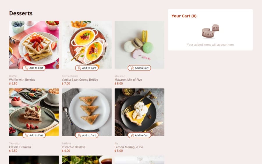
Hi! The developed solution looks good! It is very well aligned with the given design reference. Below are some suggestions from my side:
1. Update Cart on 'Start New Order': Clicking the
Start New Orderbutton closes the modal but should also reset the cart to empty. This aligns the functionality with the intent of starting a new order.2. Tablet Layout Fix On devices like the iPad Mini (768x1024), the cart box appears too narrow.
In order to fix it, consider adding a breakpoint for medium-sized screen devices. Use a 2-column grid layout for tablets instead of the current 3-column grid. Maintain the existing 1-column grid for smaller (mobile) devices, which is already implemented.
Overall, a great solution has been developed.
Keep up the good work! Happy Coding! 🚀
0

Please log in to post a comment
Log in with GitHubJoin our Discord community
Join thousands of Frontend Mentor community members taking the challenges, sharing resources, helping each other, and chatting about all things front-end!
Join our Discord